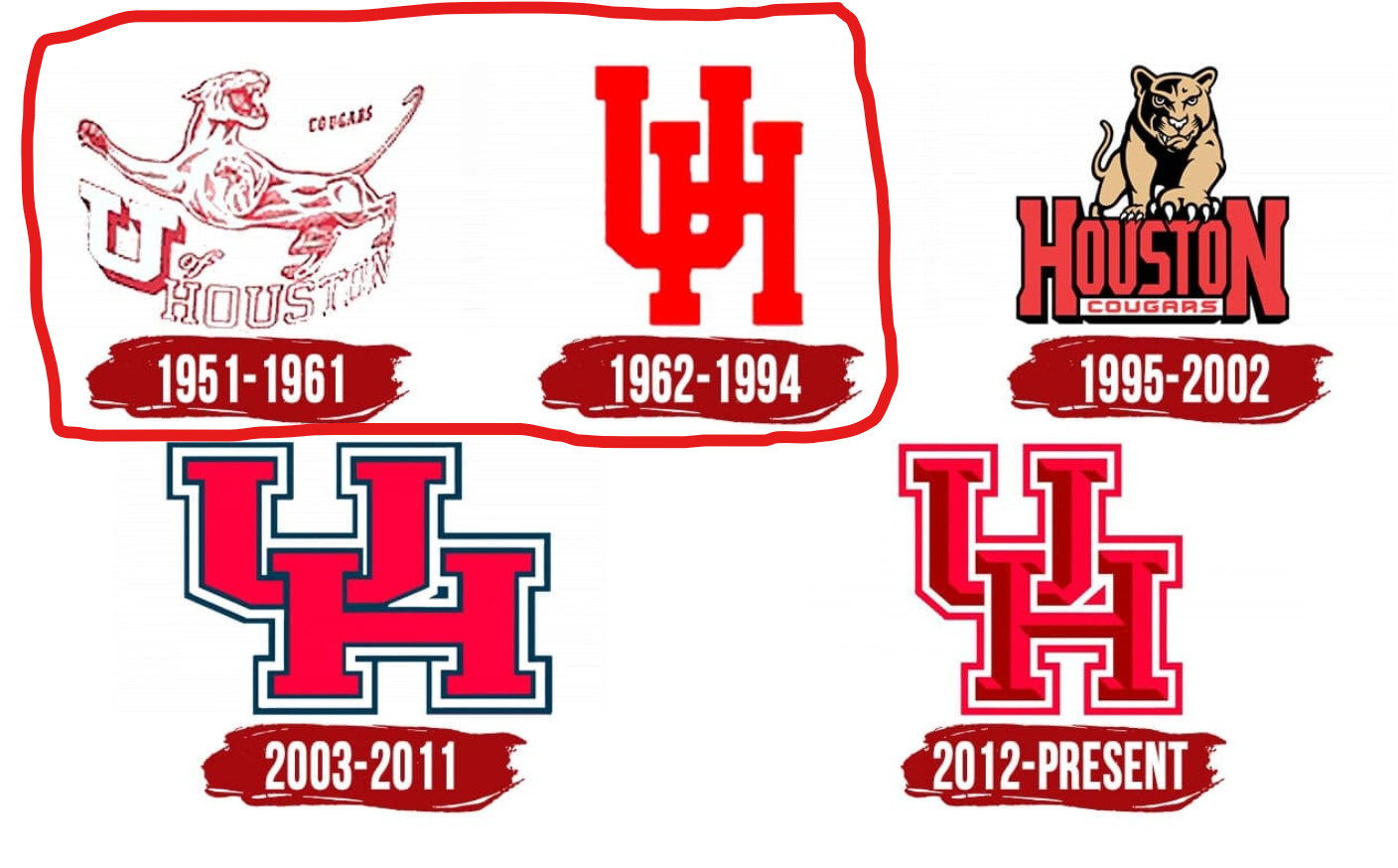
Which skinny logo came first?
I prefer most things about the old skinny logo, but the “H” always keeps me from liking it the most. It’s the high crossbar… makes it look like it’s got long legs and a short torso. I like the most recent one for uniformity and if we could combine the two…
Maybe like this?
2 Likes
That one is too fat to fit in a seat.
2 Likes
I like the current UH, as in I don’t think we should change it, but we definitely need some new secondary logos, and it maybe as simple as formalizing and refreshing some of the older logos, sailor coog is getting tired, or it could be a new cougar with a little space helmet.
My first semester cost $150, including books.
Hey Mike remember running for classes?
1 Like
1862-1994 is the one. Like none other!
3 Likes
The 1995 - 2002 logo was never used on a football helmet, which is the most visible use of these logos to a national audience, therefore it should be disqualified.
1 Like
What logo did they use on the football helmets at that time?
The old school skinny UH was on the helmets through 1998. They began using the fat UH in 1999.
1 Like
One of the great joys of getting your schedule together. Not !
1 Like

2 Likes
Bring back that chickadee that was on the header for Coogfans a while back, but add any UH Logo to her pic . . . . .
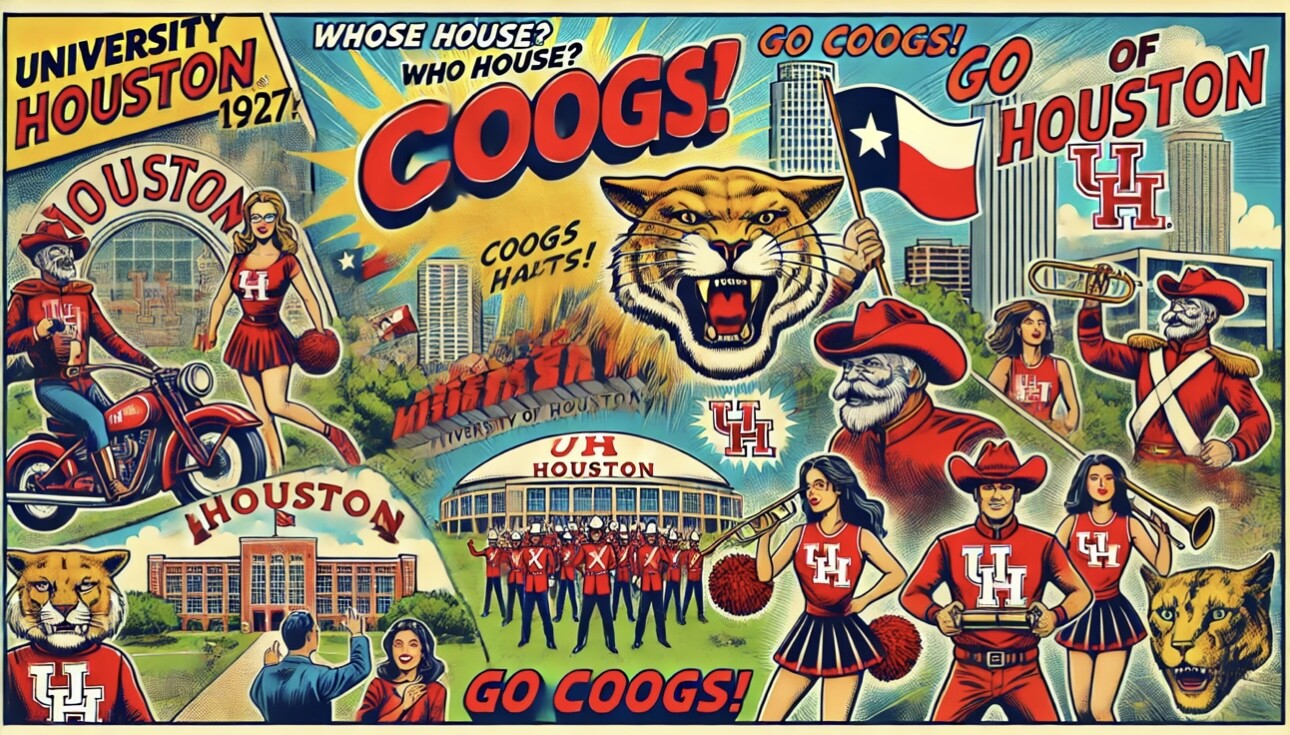
COOGS HALTS! AI?
I was at our book store and could not find one like that. I asked the Manager and he told me that was a good suggestion…Hopefully it will be available again.
UH still plays in the Astrodome? How about TDECU?
Second one really captures the spirit of Silver-Faced Cowboy Bugler (ride on in our hearts)
2 Likes
Alas, his bugle had no bell, but he sure did raise some hell.
1 Like