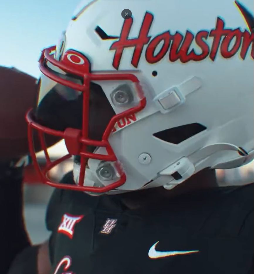
I like the white helmets, but not the script “Houston.” Give me the UH logo.
5 Likes
better than the Louisville 2016 jersey alts as you can see the numbers outlined in red.
Like the Atlanta Falcons set without gray pants
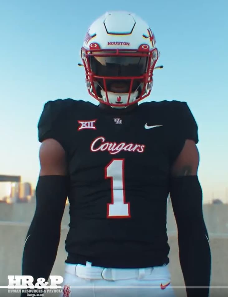
I hate the white helmets with a passion. Shoot them into the sun.
They are boring and worse yet, ugly as sin.
4 Likes
We should go ahead and do icy whites along with the Baylor icy whites and enjoy the sh!t show that entails.
We would be the talk of the weekend in college football. We’ll be the first to go from ESPN+ to featured on College Gameday Final.
4 Likes
Black jerseys for a day game don’t make sense to me.
4 Likes
We know. You let us know every time they show up.
That would be kind of funny. Or at least just the red helmets with all white. Would the officials allow it?
Black will be fine for a day game. Forecast is 75 and partly cloudy.
With that said I would have preferred red had we known BU was going to pull this “White Out” on us.
What is interesting is that scarlet red is UH’s primary color, primarily worn on home jerseys and helmets and UH has worn its primary jersey color for less than half its games. Not a trend I favor.
5 Likes
Why don’t we change the words to our fight song every week?
Cougars fight for dear old Dana
For our Alma Mater and his beer
Fight for Houston University
For Circle-K is near.
When recruiting gets so rough and tough
Stop at two cause that’s enough
So fight, fight, fight for Miller Lite
And we’ll be close to so-bri-e-ty
10 Likes
I hate this mix n match uniform crap. The scripted ‘Houston’ is just wrong. Put the white and red visiting unis on with the red hat. Leave the fashion to Mr. Blackwell.
2 Likes
Script is good in moderation
2 Likes
hate it.
but at least they finally got the helmet jersey “houston cougars” right.
if the jersey were red I’d be all about it.
1 Like
The red helmets don’t mesh with the logo on them you can’t see it from the seats in the stadium. I don’t mind the white helmets just for this reason.
So UH has been doing it wrong for over 70 years with red helmets? Don’t you think UH would have gotten the message if people complained about not being able to read the logo?
1 Like
Its the current red helmet it was never an issue before they changed it to the current red helmet which isn’t really red anyway.
1 Like
I like the matte look rather than the candy apple.
3 Likes
The original skinny logo red helmet and the fat logo helmet was fine they changed it in 2012 and thats when it became an issue to me. The red helmet hasn’t looked right since they changed the shade of red and the logo in 2012.
2 Likes
Just find ways to make your school colors attractive. To me it’s like looking at a blue coke can. Now watch those MFers put out a blue coke can. I guarantee you I’m living in a computer simulation where some geeky alien is sitting around with his friends eating purple popcorn and tormenting me with their telepathy mouse.
“Watch this! I’m gonna give Charlotte Johanssen a mohawk! Look! He did it! He threw his arms up and stormed out of the living room!”
1 Like
Y’all should be able to drink enough by kickoff so you can’t really tell the difference anyway. As long as the Baylor girls don’t steal the beer out of your truck…
2 Likes