Agreed. It should match the Jersey
1 Like
I am not sure, saw this from an Alex Holmes on Facebook. I have a feeling he made a bunch of them himself by taking a current mini helmet and then making the decals.
Would def be awesome if one could buy the whole set.
2 Likes
Super cool!
how much would yall pay for that? no clue how much each mini helmet costs, $30 each? x 35 = a grand or so for the full set?
I’m admittedly probably the only one, but I like our current primary logo the most. That said, from an objective standpoint, yeah, the first picture there is probably the “best” UH helmet we’ve had. I’d be curious to see how it would look on the current candy red helmets and on a modern uniform design; I think it may look better than we’d expect.
All I really know is that Phat UH was a mistake.
1 Like
I messaged the dude to see how the collection came to be.
1 Like
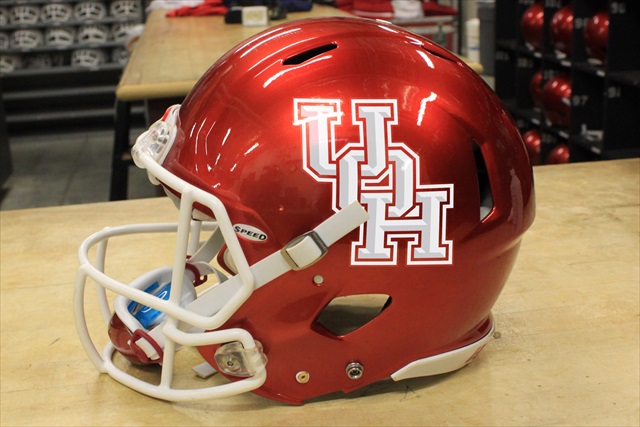
The current logo is a good logo (looks a lot better red on white helmet IMHO). I like it… for me the Skinny UH just has a more classic look that never goes out of style.
Looks like doesn’t have the skinny logo white helmet we wore the other week but dude is probably working on one
Those are pocket helmets, which usually run about $2 or $3. The actual price is probably about $150 + shelving, I’d guess, depending on how much he spent on paints and stickers.
2 Likes
My favorite helmet is every one that isn’t white.
3 Likes
Forgot one…
12 Likes
oh my, please tell me that never actually happened lol
Actually, upon further inspection, it looks like this hasn’t been updated since about 2016 or so. It doesn’t look like the flat version of the current logo is included at all, only the beveled one. The gray logo with the stripe is missing, too.
What’s the one at 6 across and 4 down? I don’t actually recall that one. I remember getting a t-shirt at a game around that time with the words to the alma mater in the shape of the logo, which is what that looks like, but I don’t actually remember the Coogs wearing that logo on a helmet.
Skinny logo is my favorite. Phat logo is a nightmare. Current logo is just one rung better than the phat.
1 Like
I don’t recall us wearing the Thunder Coog logo. Thank goodness though. That thing is terrible!
Run-n-shoot look is best but I’m okay with what we have so long as no white helmets. Boooooooooooo!
1 Like
I think that was a Tony Levine April fools prank.
3 Likes
The only time I recall us wearing the full-oval ThunderCoog was the 2012 Homecoming game, which is probably in our bottom-two worst looks.
1 Like
The Helmet Project link above shows 4 variations of The Thunder Coog logo/helmet color/facemask color worn for a total of 7 games over 3 years