Media Bias Chart

Seems pretty accurate to me.

What strikes me the most though is the sheer number of outlets, meaning how easy it is for somebody looking for confirmation bias to find it and for outlets to look for and reach target audiences.

As for me, I ignore the extremes but look for different points of view. I also hit fact-checkers hard.

1 Like

Yeah, that’s a lot of sources ! It’s a problem, or should be a problem,
for all of us.

But is this valid if RT International is not on the list ?
/s

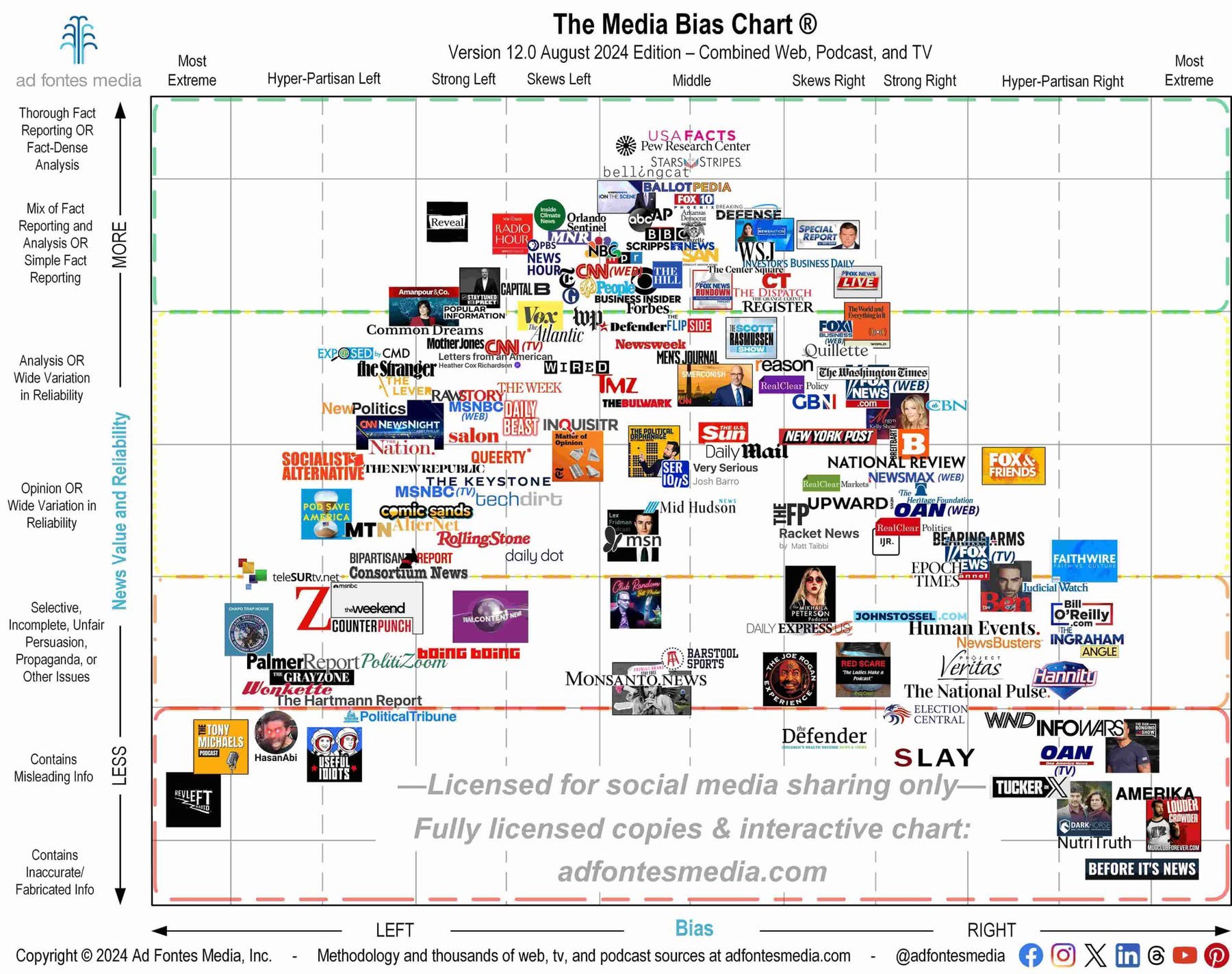
I was of the thought that the Lex Friedman podcast would be more towards the “Skews right” area.

BillO’Reilly.com should be more towards strong right and more towards the middle in the News Value and Reliability. They got that wrong, in my opinion.

They got Maher right.

ABC and CBS should be a little bit more towards strong left. Just a tad bit more. Hell, I’m surprised PBS News Hour is placed more towards the left than those two, lol.

NBC is way out of position being placed where it is, lol. My goodness.

Special Report with Bret Baier is just right. Good show. Really the only show on FOX News that is worth a damn, in my opinion. And I mean that in terms of presenting the news in a factual way, and not too biased. Overall just right.

Now, FOX News should be placed more towards Hyper-Partisan Right. MSNBC, on the other hand, more towards Hyper-Partisan Left.

OAN (web and TV), as well as Newsmax should be placed more towards the “Most Extreme” area, lol.

They got the WSJ just right. And I say this as someone who reads it daily.

Admittedly, most of the podcast on the chart, I do not recognize.

I don’t see Cuomo or On Balance with Leland Vittert. I would say Cuomo is more towards the middle. Maybe a tad bit to the Skews Left area. On Balance would be around the same area as Special Report w/ Bret Baier.

Overall, I believe they got it, somewhat right. Again, the podcast, I don’t recognize. That’s just me though.

2 Likes

That’s an interesting graphic,

Is Politico on there? They seem to be pretty close to The Hill, but I’m curious where they would fall.

I wonder where the company that made the chart would put themselves.

1 Like

Here’s their methodology. They’re in advertising, so it would be important for them to accurately classify an article in order to target ads to the consumer.

That’s a good analysis and agree with many of your overall comments on these.

I agree with 98.6% of this. :face_with_monocle: Not bad!

Bill Maher, just a tick left from dead center, is accurate

And remember on any site, look for that “opinion” tag. It could be a sponsored article or something, but is usually not vetted to the same standards that a true journalistic article would be.

CBS news made an interesting hire recently and may be moving downward to the “misleading” category.

The big thing is, outrage is proven to drive clicks like no other emotion. Read several articles on a topic before jumping to conclusions, and never trust the first tweet about a story, unless it’s from gocoogs :slight_smile:

1 Like

Well, NewsNation, PBS News Hour, The Hill, and NPR are my four main news sources, in that order.

All are pretty close to the Center, like yours truly!

That, of course, makes them more reliable and more likely to be correct.

1 Like

The issue is the center/middle has no voice in the matter. I am very much like UHLaw on this. You should see how f*cked up the algorithm gets on Facebook and Instagram when I watch reels from both sides for more than 10 seconds.

1 Like

YouTube is the worst one in my experience. I click on like two clips from South Park and all of a sudden my recommendations are hour-long “documentaries” “proving” that 9/11 was an inside job and speculating about a certain demographic controlling the media.

The algos know you better than yourself! j/k

Just like some posters here.

1 Like

As far as the actual infographic goes, idk. It feels weird to categorize CNN’s TV programming to the left of The Daily Beast, for example.

It’s also extremely interesting (albeit unsurprising) to me that news sources share partisanship within their genre; tech news and celebrity gossip are unanimously left-leaning for example, while religious news and business news lean noticeably to the right.

I don’t think the number of news sources is necessarily that much of an issue; in a more conventional news market, high-quality news sources that are aligned with mainstream opinion like ABC and CBS would generally be more consumed, and it wouldn’t be an issue. I’d have never heard of HasanAbi or Steven Crowder in that world. The bigger issue is that social media is now capable of targeting content delivery to maximize engagement and is incentivized to do so, which thereby encourages hyperpartisanship. Twitter doesn’t show me post after post of starving Gazans because they think I’ll like it or that it will inform me — they show me that content because they know that I will have a strong emotional reaction to it, regardless of what that reaction is. That means more time on the platform and more ads consumed. It also means that if you want to make money on the platform, you’re better served baiting clicks than informing people. People are less likely to click on a nuanced examination of an issue than they are “Grifter of the Month OWNS the WOKE LIBS with FACTS and LOGIC”.

If you want anything approaching a healthy news diet nowadays you have to actively seek it out. You can’t even block the folks that are obviously spreading bad-faith misinformation, because there will just be another to take their place, like a hydra of hogwash. It’s exhausting.

Exactly!

Unsolicited spam is also an invasion of privacy but that’s the price I pay for being too lazily ignorant to figure out how to block it but I shouldn’t have to, IMHO.

+1.

The chart really does its users a huge disservice by conflating opinion writing with a lack of reliability. Opinions and analysis supported by reliable facts are important and good; unreliable news is not.

Isn’t this a political post?

1 Like