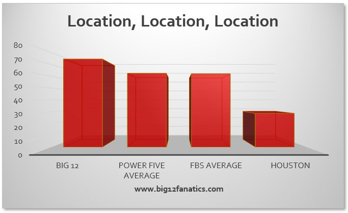
^ Dumbest thing I’ll see today.
Yeah, what is that? It’s a chart with red bars.
Did that Buck Ferguson guy write this garbage
“The Number Monkey”
It looks like those charts and numbers were created by a monkey.
Good lord; that was a prime example of how not to make an argument. A bunch of words that don’t really say anything backed up by incomprehensible graphs that are supposed to prove a point.
that pretty much sums up what the Big 12 are looking at right now, no wonder why they can’t make any decision based on that kind of information.
I really want to respond to the number monkey and ask for details. However, I don’t think any actual statistics or hard numbers were used to make those charts. They look like they are only based on the author’s opinion with some arbitrary numbers assigned to each.
This took little yet way too much effort to put together just to troll