Somewhat fair, though I think TCU, KState, and Kansas’ unis stink. The latter has never found a combination of a logo (Jayhawk or “KU”) and font size to not make their unis look Mickey Mouse.
Iowa State has killer unis, WHEN they utilize the combinations correctly. The problem is they routinely do stupid stuff, like the black unis (get rid of them), red helmet and jersey combos, etc. Our best look is the Cyclones scripted helmets, with white helmet and white jersey, or the yellow helmets.
Personally, I think we should can/abolish the red helmet. Not only is the look inferior, too many schools have them anyway. Utilize something unique that also happens to look better.
I generally tend to agree, red on red up top is hard to pull off…except would something like THIS give you pause? For me, I could get on board with these as our red helmets. Especially w/ white uniforms, but even red there’s enough accent now where it might work. Moving away from red pants at home is a step in the right direction, too:
As for your stinkers, I actually like the KState uniforms. Particularly the roads, and especially under the lights. The home purples, ok, I can totally see where you’re coming from. But the silver/white/silver combo is clean and really pops under the lights…especially in person. And the roads help a flamboyant color like purple not be too much when it’s just an accent. If you’re gonna go heavy purple it’s gotta be modern/futuristic, not classic. TCU wears it heavy much better for this reason, IMO.
The helmet Jayhawk? I actually like it. The KU, I do not. Agree everything from the neck down is just a miss for me. Especially the red. Stop doing this KU (as well as UA basketball. UA Football tho, it’s not as bad and nobody really cares about UA football anyway.)
The TCU jerseys, they’re fine with me. I think they are good, actually. Always liked the helmet logos in particular @EndlessPurple …but I could see why some might say it’s better w/ the spike collars, but it’s not necessarily make or break for me personally. TCU I don’t really have complaints.
Red helmets, red shirt, white pants. Thats who we are, thats who we’ve always been. I do like the 60s uniforms, and wish we would just WEAR them all the time, like Texas does with theirs.
I agree that the homecoming uniforms are overrated. I don’t like the candy apple though. I just don’t like our uniforms period. I would prefer to stick with the white helmets, actually.
For a decade or more now, the candy red helmets have been the only distinctive element of our uniform aside from the logo. Everything else we have worn could have been worn just as well by ULL or Louisville or Utah or Western Kentucky or any of the other dozen or so red-and-white-and-sometimes-black teams in FBS. Utah has a distinctive sleeve stripe, Texas Tech has a number font that’s very distinctively theirs.
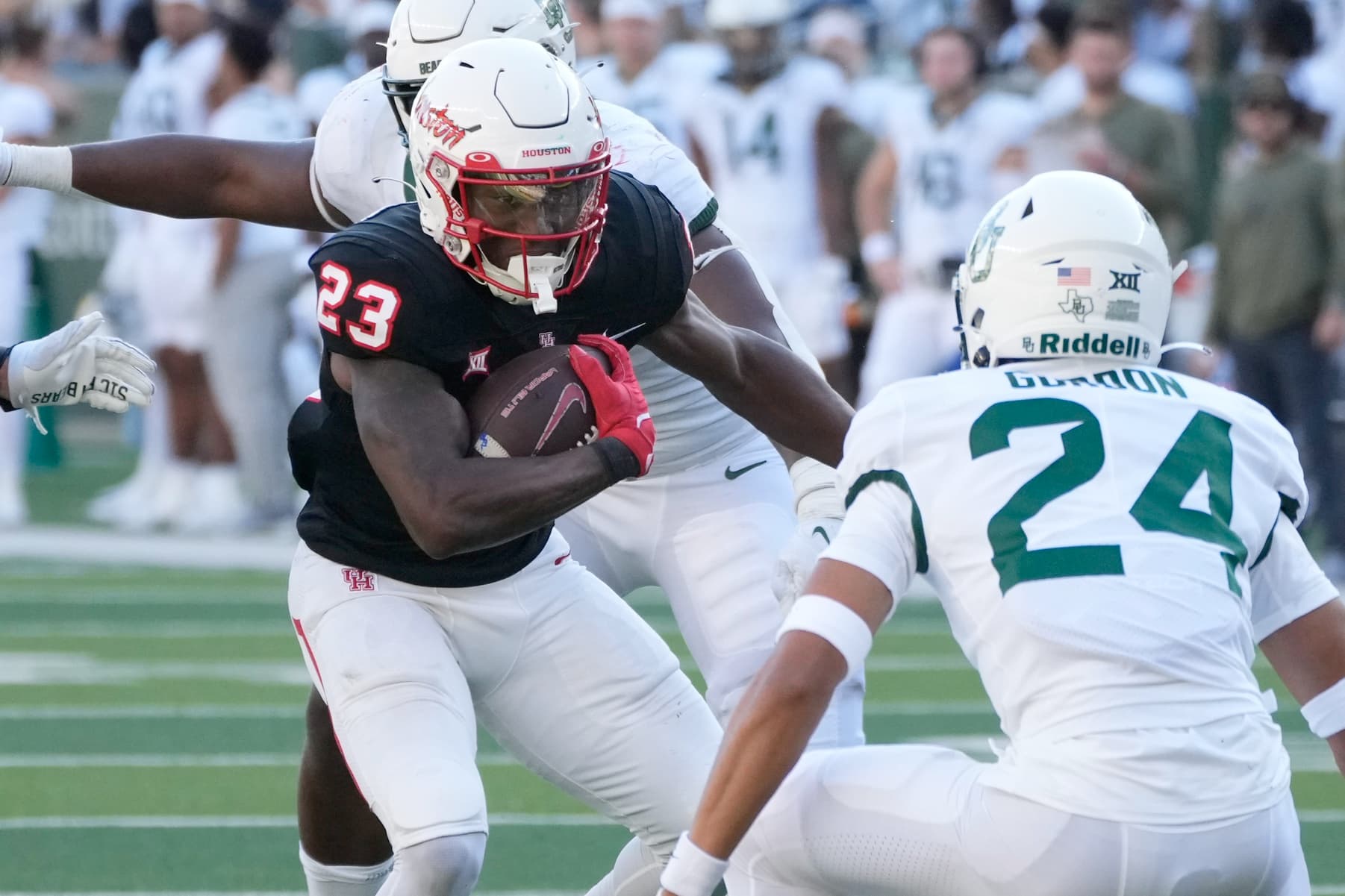
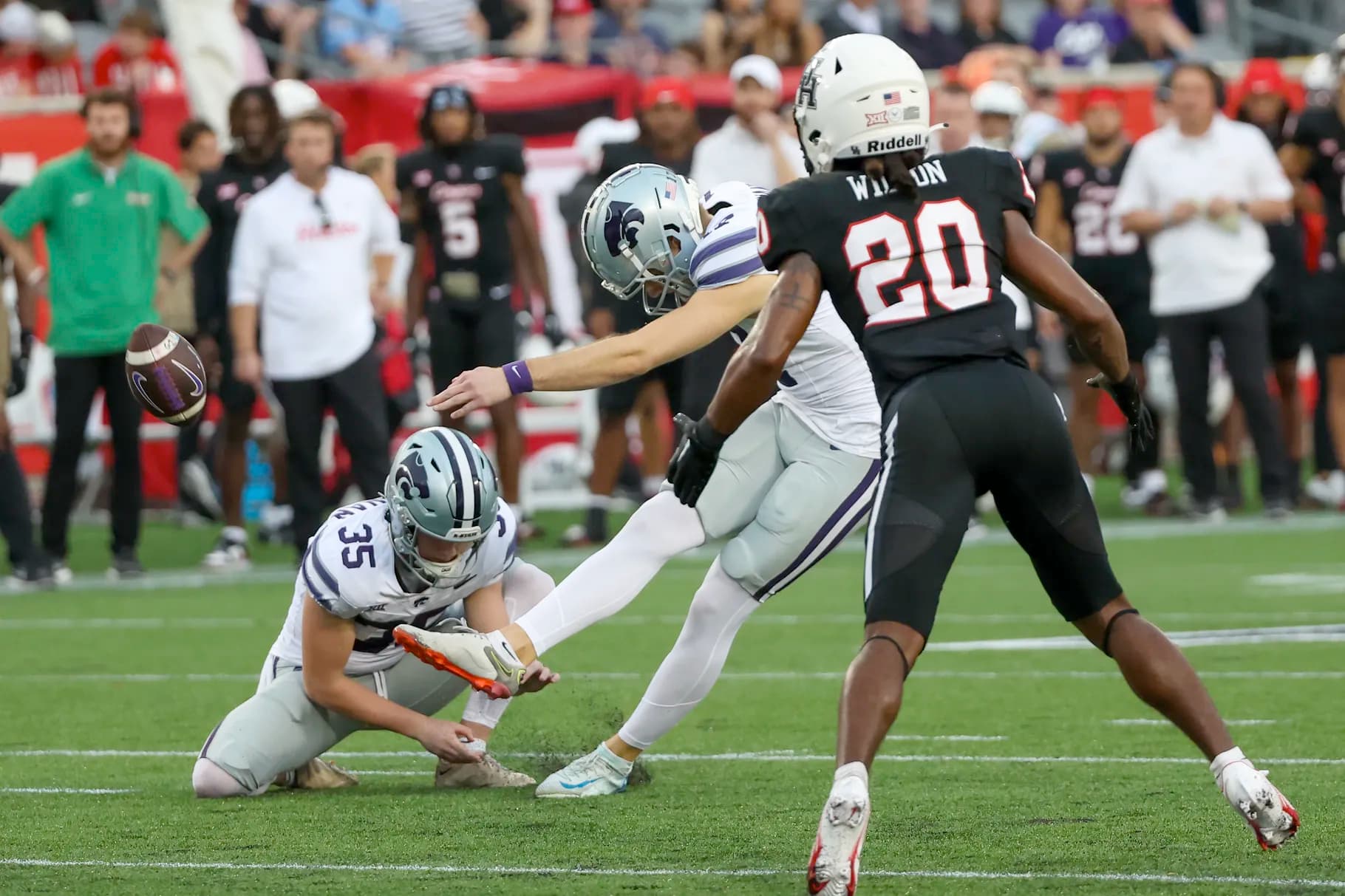
How long would it take you to identify who the team in white is in this picture if you didn’t already know?
Our uniforms should be easily-identifiable at a glance; it should be impossible to get us confused with anyone else if you catch a half-second highlight when you’re scrolling through TikTok. Without the candy red helmets as a clue, that’s a lot harder. But nobody else in the country does candy red – a few teams have done red chrome, which is similar, but it’s never the same.
Not only that, there are like 10+ other teams that wear white and red uniforms (Stanford, Rutgers, OU, Nebraska. Bama, Wisconsin, etc.) Add luv ya blue permanently to set us apart…even just as a secondary color. It’s official Houston colors after all.
Actually I like our uniforms and so much so that I think we should stop the alternative ones. We wear so many alternative ones, it’s rare we just do the red or white. Again like red posted , Lsu, Michigan, Bama etc keep it the same thru decades and it creates brand. We change ours every other game it seems and it’s bush league gimmicky.
The helmet doesn’t match the red pants well, to me. The only uniform combo that I like the candy red helmet with is the white jersey and white pants. I would actually like to see a matte red helmet. I don’t like the black uniforms.
I always treated the candy red helmet as a gimmick. It can’t be for merch sales. Your average fan doesn’t buy helmets. Candy red helmet is a little too designer for my liking. Bring back the red matted helmet. And while you’re at it, add two stripes in the crown.