Hang this on the locker room wall and remember it this on 9-12-25, insulting our unies.
1 Like
Eesh, I very much disagree with this list.
4 Likes
Sometimes the truth hurts. UH’s red unis is a lazy effort and lacks any creativity. Add some sleeve stripes, side stripes on the legs. I have always liked the navy blue outline. I prefer the red matted helmet than the candy apple helmet.
I think BYU unis are better than #10. I would put them in the top 5.
5 Likes
ASU… ummm no…
1 Like
I don’t know why UH moved away from the stripes on the shoulder pads. That was our best looking uni combo. Now we have the numbers on the pads and rock the candy apple red helmets too much. White helmets until we can get proper UH red helmets.
5 Likes
Seems like it is more about school colors than uniform in some of them. Also inconsistent in some reasoning.
UH is too low. Nice clean classic with that one chosen.
Don’t mind ASU in top third. Also K St is good.
Arizona should be higher, IMO.
Baylor is too high. One of the worst along with Kansas. (Bottom two)
TCU about right for one chosen - it is not good. However that is by far the ugliest one TCU used during the season. For the couple that had many variations, the author did not try to pick good ones it seems.
Might bump Colorado a spot or two.
Problem with the article titled 2025 uniforms when these are all last year.
4 Likes
Our uniforms look good to me. I don’t think all of the BS about new unis all the time is worth the effort. Look at Michigan, Ohio State, LSU, Penn State, Alabama, Notre Dame, etc.; they’ve had the same uniforms for as long as I can remember. Red and white looks good, period.
1 Like
So let me connect the dots…
A well designed uniform will have more demand by the public, which translates to more merchandise sales, which translates to more money in
UH’s pocket.
UH is not Penn St. or Alabama. UH needs additional merchandise sales as a source of Athletic Department revenue.
2 Likes
UH’s uniforms are way too plain.
6 Likes
Click bait…
I’ve said it at the start of every season since 2012. The 2011 Homecoming throwbacks (maybe even use the current UH) should be our routine scheme. Then the flip for road. Throw in some blacks for alternative and call it a day. Our current uniforms are as bad as the wetcat Briles unis.
We should wear those every time we play a former SWC opponent.
3 Likes
What it feels like in uniform threads as someone who loves the candy apple red uniforms and thinks the 2011 homecoming uniforms were overrated

4 Likes
Look at:
Sleeves with number
Helmet with centered lines and with the UH logo
White pants with Red and black lines
Houston on the front
Now that is a statement.
4 Likes
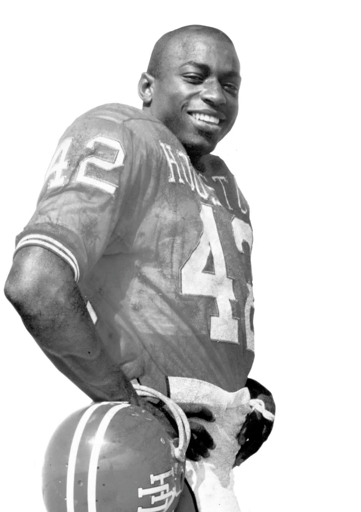
Marvelous Warren McVea!
5 Likes
I, on the other hand, think the traditional red home uniform is the best in the conference. There is a lot of envy in this article from a Colorado fan site.
second that, i like the cougar red. in no way is that a practice uni.
i would probably place the coogs 3rd behind the sun devils and kanasas state uni’s
1 Like
Was he intoxicated when he made that list?
Well certainly high.
Love that combination as the primary home uniform. The stripes on the helmet and sleeves make the uniform pop and visually more interesting.
I would incorporate the black uniform for Halloween only.
I have already grown tired of the Houston blue uniform.
I would keep the black and the Houston blue uniforms in the rotation as long a merch sales justify it. At some point, merch sales will tail off, and it will be time to put these on the shelf for a while, to build back up the alternate uniform mystique.
2 Likes