It looks like Rice, with the Old English lettering.
1 Like
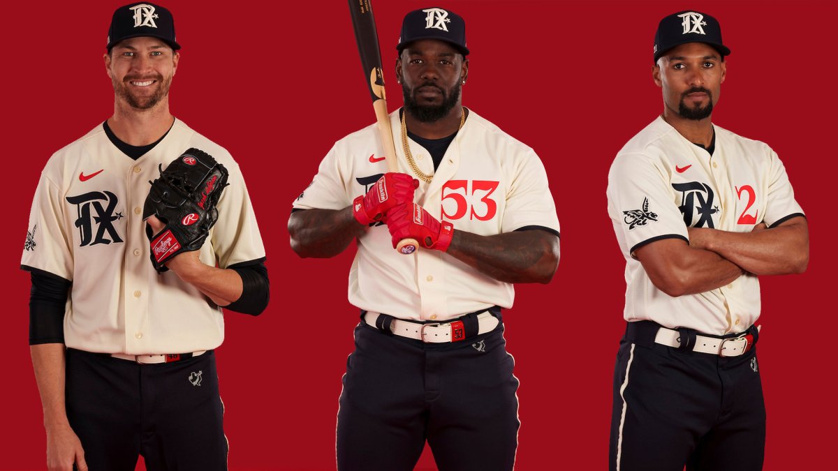
The Ranger’s City Connect uniforms are as ugly as their stadium.
And the camera angle is too high….it sucks as well.
3 Likes
The Rangers play in a city…?
1 Like
Glad other people came to the same conclusion. Was trashing it earlier. Ugly doesn’t do it justice.
3 Likes
I am not a fan of any of the City Connect uniforms they all look cartoonish. But the Rangers unis are but ugly. Not only is the logo Rice’s the blue pants are Rice Blue as well.
What city are they trying to connect to?
1 Like
I have yet to see a city connect uni that I like. That includes the Astros. I like the jerseys but the pants make them look like they’re wearing softball unis. Too much blue.
2 Likes
Never been a fan of dark pants- white or light gray only.
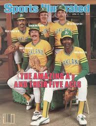
Greatest Unis of all time
2 Likes
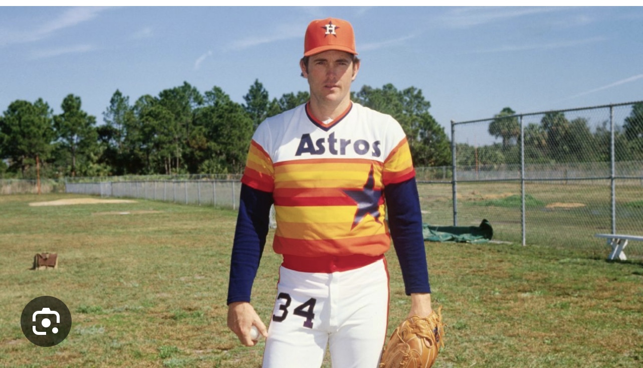
Yep I am a fan of the rainbows.
1 Like
It’s a Peagle.
That Rangers logo is the worst I’ve seen in my +65 years of watching MLB. It looks like a Chinese character.
2 Likes
![]()
![]()
![]()
![]()
Not me…looks like an all-day sucker!