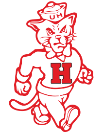
What distance are you looking at the UH logo from where its shape isn’t visually distinctive?
Outdated? Whorn has same logo every year…so do lots of other high profile programs. We dont need new logos when we already have the great ones from the 60s and 70s. Most of the new stuff they try looks terrible. Why? Because they want to do something different from what they have already done…Whole premise is ridiculous.
Think this should be our official secondary logo. We havent had an official secondary logo since the red and blue thundercat style logo

100%
Because they want a bump in t-shirt sales (t-shirts that you can’t hardly find in a lot of the local places). Seems like we’re a school too caught up on modernizing to be concerned with things like our identity.
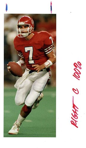
I agree. I’d take the 80’s Run-N-Shoot Coogs gear over that 60’s stuff anyday. And hey, for you Freakazoids, it has some of that pretty University of North Carolina blue you like on the pant leg.
