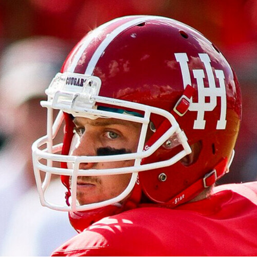
Why is there so many different variants of our logo? I know we did the beveled and alternate unis for recruits or whatever, but it seems to me like there is a move to the classic old school logos; Bussin’ With The Boys on X: “Texas Tech will be changing their logo moving forward in 2026 Thoughts? https://t.co/zIpBfSoxb9” / X
This should be an interesting thread
rightfully so! Perception is reality and there is zero unity on this issue.
Why do we care about tt logos on Coogfans ?
Are you going to do an update status on all Big12 schools logos ?
Changing logos can annoy the fanbase, but is very profitable. I would be all for us doing something like this because it would jumpstart our merch sells.
Tech started using a version of current logo in 1999 we are on our 3rd logo since then. I would love to see us go back to the logo we used on the 95-98 helmet, but I would welcome back the fat logo just to see some of yall meltdown.
I said this already in the Big 12 thread, but I think this is a pretty clear downgrade. Their fans seem to like it, though, and I guess that’s what matters.
For what it’s worth, we quietly leveled our bevel around 2019 and haven’t looked back; we don’t really have a ton of different logos anymore outside of just changing the color scheme on the one that we have.
On this I agree; hope to see updated logos for academic and athletics for
the centennial in 2027. Or sooner.
I disagree re: UH needing a new primary logo. The value of a strong, consistent brand is probably more valuable than the increase you’d get in merch sales. Our current primary logo is admittedly a little boring, but we could do and have done much worse.
And the ugly script font.
It looks good. They also upgraded the other, alternative logos.
Merchandise is sh**or us. The fat logo IS NOT attractive, and worst yet, is even more unattractive in printed hats. Why does it have to be so complicated? Stick to classics and see merchandise grow. Even a simple red “HOU” hat is portrayed as classy (elegant) and of good taste. Now, contrast that to the ‘wild cat’ **** we have seen in years past.
WE NEED class and elegance. It’s a uniform that sustained good records, nostalgia, astrodome, etc. NEW logo reminds me of nothing but revolving door coaches, NIL, and disparity.
Great logo, clean and distinctive. Why cant we have it every year?
Yea it reads like a blob from a distance instead of a UH.
We already took the bevel out of ours. But why do we keep talking about tards. F them
I could not care less about the TT logo, I have enough to complain about with our blue uniforms and changing our UH and cougar symbols every few years.
Another new tech thread.
It’s another scheme to sell merchandise. Who wants to walk around with an outdated logo? It screams, “hey I’m poor and cannot afford the new logo,”
So aggy is doing, what seems to me, like throwback uniforms.
Imagine if we did the same. One year we could do throwbacks, and the other Houston blue or blackout.
