Did not know we had a hockey team back in the 30s and 40s. We now apparently have a club hockey team. pretty cool. Hockey games are tons of fun, really hoping Houston can get an NHL franchise
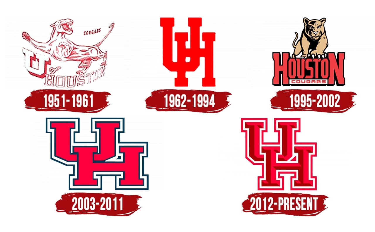
1962-1996 is the best. I want to go back to that one forever.
Ah, the Thundercats!
Coog 15,
Where did you find that beautiful Red UH diploma frame?
Another misstep. I think the cursive was introduced at the same time. I like the cursive. I think baseball was the first to embrace it.
Would like to see just an H logo. Could be more iconic imo and afaik no one else does it (except Harvard?)
Had it custom made at Jay’s Frames in the Heights.
Thunder Coog, wouldn’t be bad if Penn St didn’t essentially have the same logo

At least ours looks more like an actual predator cat. Theirs is more like a chipmunk
I think we change logos so we can trademark them and make money. The only problem is they don’t hire anyone with talent to do them.
They are usually done by the licensing agency (currently Learfield), so typically it is the same team that does a logo refresh for 100 other schools. However, they really could do some better localization of special secondary logos. Thinking like the endzone with the skyline, or just getting local artists/creatives t create special versions for limited edition.
The past just flat doesn’t live or play in Houston-and that definitely goes for UH. We have a few banners and statues to remind us, some trophies, and then its space city to the moon for remembrances. Even for a while this year I was afraid our colors would change to black/white considering the apparel of the coach(?). Tradition–naw. Letsee, how 'bout a buzzard for the new mascot-its kinda black/white.
I definitely wish we didn’t change uniforms every year.
As long as it is red and not powder blue or covered in glitter or vandalized by some other deviation, it’s fine.
We don’t.
Well, basketball we do.
Here’s a quick graphic. I’m a product of the 1962-1994 logo myself, so that’s the one that rings true for me.
Yep. The skinny logo is the best. We should all ask them to bring it back.


