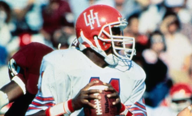
Skinny is unique!
1 Like
7 Likes
We did win a conference title in 1996 and the 2001 season didn’t happen in the specified time period.
Bring back skinny UH. Graduated in 2008 and the 62-94 is the best logo. It truly represents our university.
The current one is a Kentucky knock off. We need our own identity.
3 Likes
I wish we we would go back to the skinny logo. Sometimes you need to resist the urge to modernize your logo in favor of history and tradition.
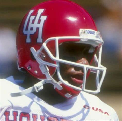
To expand the convo a little, as far as the helmet, I like the matte scarlet red with two white lines at the crown and gray facemask. You can probably talk me into a solid scarlet red with no lines with very little effort.
3 Likes
We had both phat and current versions before Kentucky I believe.
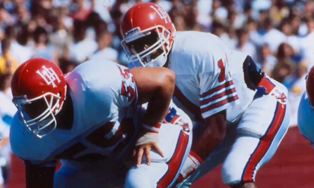
I like current with skinny as troback / alternate (and I’m a Jenkins / Helton era student)
I have zero artistic skills but I think that logo is supposed to suggest the downtown Houston skyline.

Not my favorite but I like it!
No we didn’t. The Kentucky phat logo has been around since at least the mid-90’s if not even the early 90’s and into the late 80’s.
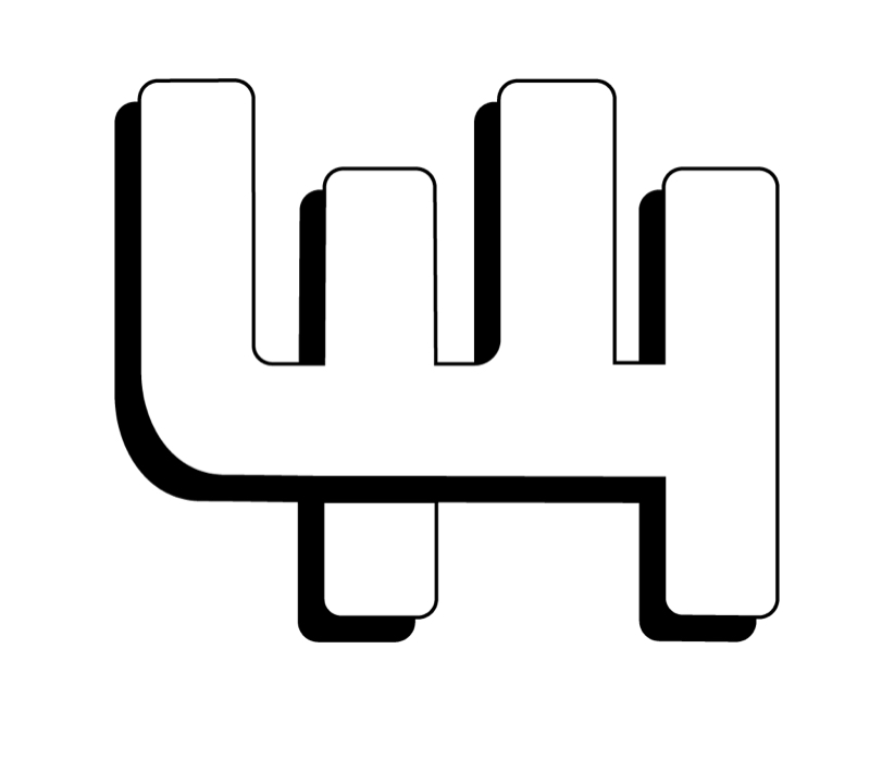
That 1995-2002 logo has always bothered me. The block letters are ok, the cougar is kinda cartoonish, but what REALLY bothers me is the giant “N” at the end. Like we were trying to emphasize the “H” (of course) and the “N” (Why???)
Artist gone wild?
Everytime I see that giant N it sticks out like a sore ThumB.
Hmm… looks like uk had phat logo first (1997), but we shifted to current logo earlier than them . So we bit first and they bit back
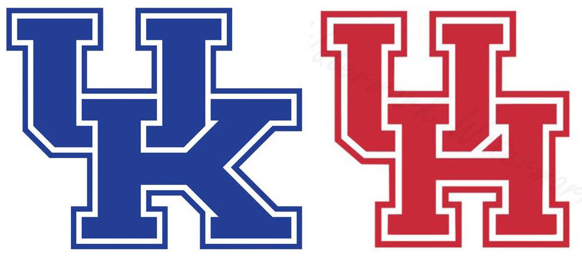
This is the one we did first.
As I accurately guessed, their logo came first. The UK block logo dates to 1989:
Slight change to it in 2005 but basically the same logo since 1989. Ours dates to 2000, from our very own website as the source:
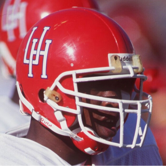
Skinny interlocking UH is good but the messed up symmetry of the H with the short arms and
long legs bothers me. My third favorite. Beveled interlocking UH and one with Cougar over U of
Houston are tied for 1 for me…
Now somebody needs to make a logo poll and see how it shakes it.
And this monstrosity is so bad , and having never seen it , it’s almost honorable mention…
except I keep seeing 44.
1 Like
I think that the top skinny logo is too skinny. I like the bottom photo and think think that they should use that. My favorite is when it’s red though, like up top.