UH Logo

Not quite correct… the logo on your source going back to 89 with the wildcat is not the phat logo. It’s not nearly as squat or fat.

The one that the site says started in 2005 is their phat logo. That being said you can find their phat logo on helmets back to 97, so it predates ours.

Our current logo (2012 or 2013) predates their version, so we were first on that one.

That triangle is the outline of the U and H, would look horrible with a white blob in the middle.

The skinny UH logo we wore in the 60s and 70s was worn by our greatest teams…We need to go back to it as we move forward in Big 12.

5 Likes

You tell them @aldineblue!

1 Like

Do a poll and send to Dr Khator

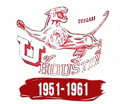
Weird how some logos are omitted. I’m slightly partial to this one that must be from 70s/80s? It’s from a paper book cover that my mother put on a book from her doctoral studies. Could be really cool and unique with a refresh.

4 Likes

Not the 80’s as I was there 81-85…

Late 1970s I believe. It was another attempt to “freshen up” the logo.

I wonder if there is some metric that indicates when a logo should be updated? If so, are the blue bloods aware of it?

Skinny Logo is what I went thru school with, Ware won the Heisman with it, we should’ve never changed it.

2 Likes

They are very much aware. Michigan, Alabama, Florida, Florida State, Oklahoma, Georgia, USC, UCLA, Nebraska, Notre Dame, Ohio State even Texas are all using branding/logos that have been refreshed in the last 20 years. Many within the last 10 years.

1 Like

Was used when I was in school. Not as cool as the interlocking. Why do we have so many damn logos!!!

lol. :100:

I remember when we got into big12 Duarte wrote an article in a series and one part was branding. He mentioned the various logos all across campus and need for uniformity. I believe the article said the current logo will replace all other logos that exist throughout campus.

1 Like

image

This one extended past the 1961 date indicated. It was being used on parking permit car window decals when I started in 1970.

3 Likes

When I was at UH 83-86, I bought a tank top shirt at the bookstore with that 51-61 logo…it’s classic.

1 Like

Where ever it went it can stay there

7 Likes

Any good AI websites to play with logo designs?

Tank top :see_no_evil: :laughing::smiley:

1 Like

Yes, we stole the ugly squatty fat logo. Then in 2012 we refined ours by making it more vertical and less fat. Shortly after UK copied us. :face_with_spiral_eyes:

1 Like

It looks horrible. It looks like a metro rail signage. Nothing in design stands out. I feel like I am eating a cheap burger with a tasteless meat patty, colorless lettuce, expired ketchup, uncooked french fries with too much salt and pepper coming from the laundry room. That will be a no.

2 Likes

Ha!, yeah back when I was a kid I could wear those without looking like a, well, you know. And, I played a lot of pickup basketball. :grin:

1 Like