Really nice throwback ! Your daughter has good Cougar taste.
Go Coogs ! !
1 Like
I think I remember an interesting thread from several years ago about if we are the first school to use interlocking / overlapping initials on helmet. Doing a quick search the only other I could see from earlier was an Indiana with IU on front or back of helmet. Not an exhaustive search by any means tho.
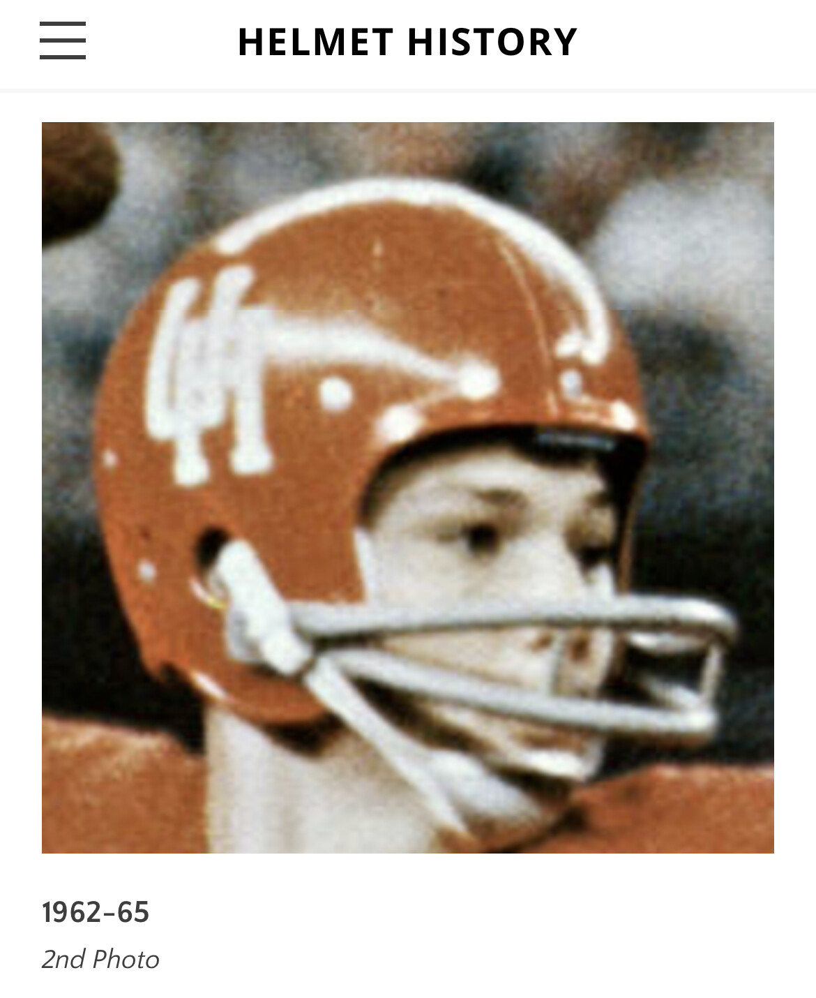
Here’s a 62-65 credit to helmethistory.com
1 Like
That exact color and logo is what we need today. Also, a matte red helmet with that exact logo.
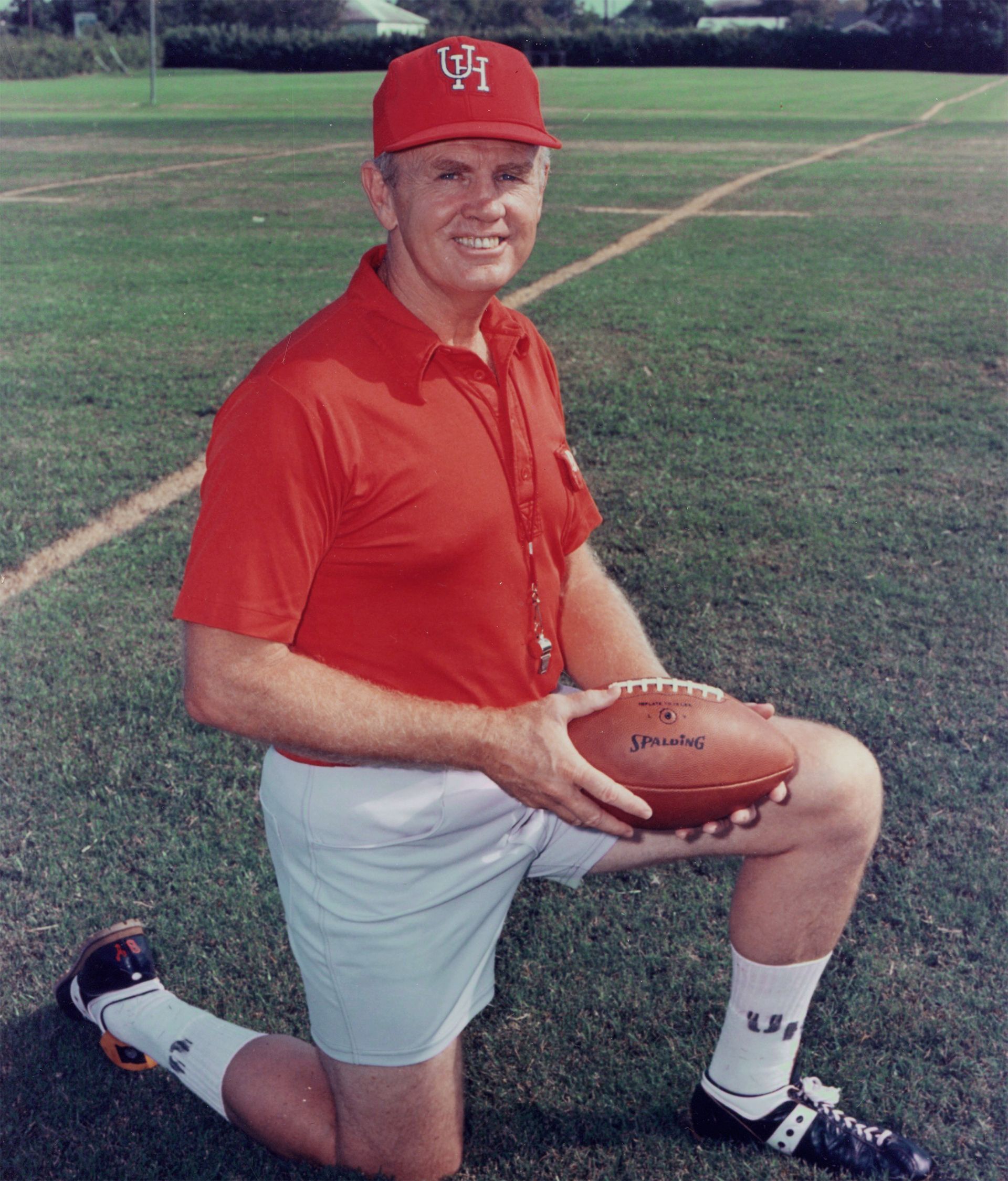
I am a more “mature” individual and when I was @ UH we had the skinny interlocking UH, like the 1994 helmet: Simple, classy and it didn’t look like it was generated by computer
2 Likes
The skinny logo is timeless.
1 Like
Which skinny logo? I have become fascinated with the variety of variations
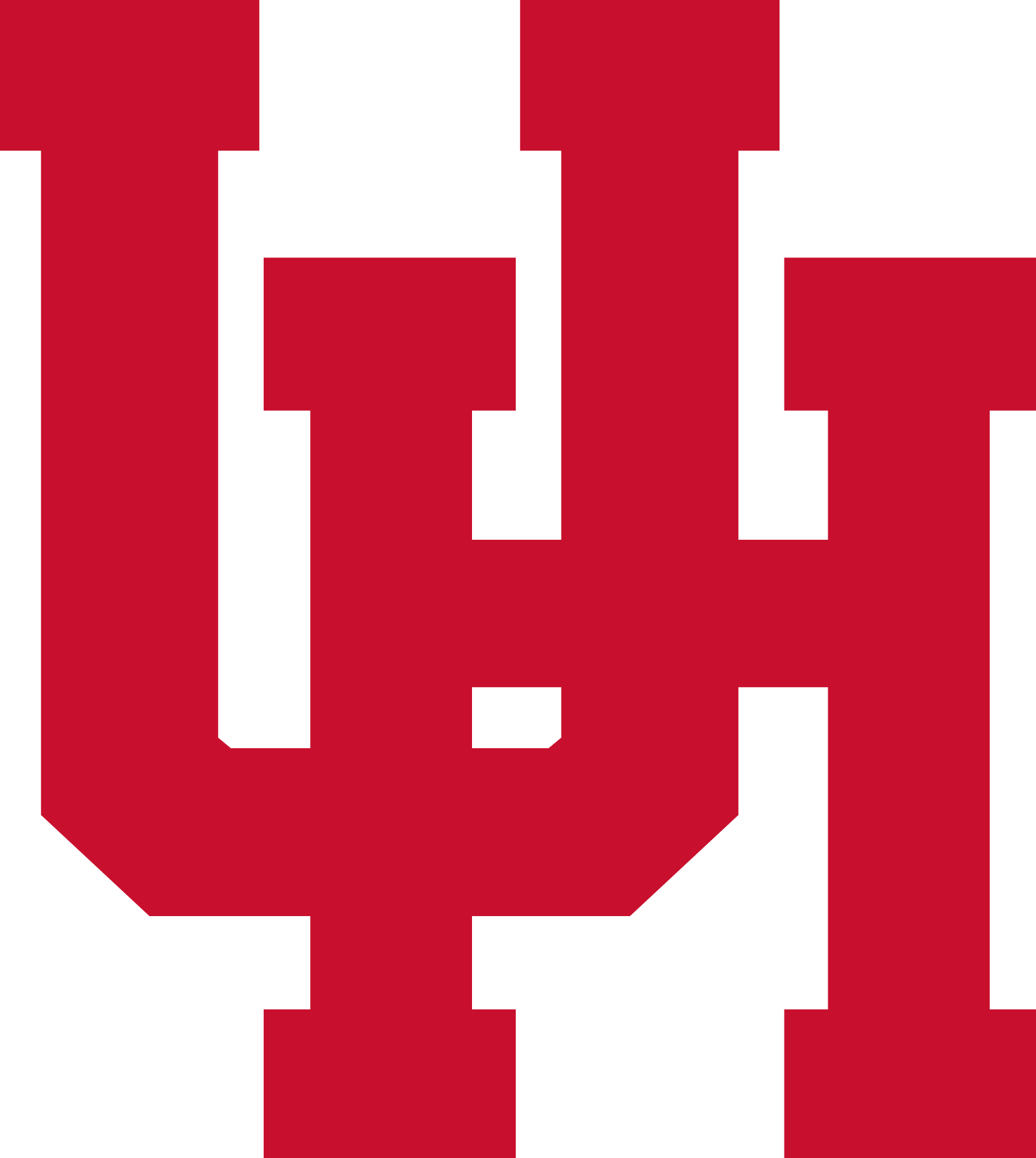
The traditional interlocking with square U from the helmets

We have the U over the H with the curved U
Here is the H over the U with the curved U
Did they order hats by saying create your best UH logo from memory?
6 Likes
I’m old but love the new beveled shaded logo.
1 Like
I’m in this camp. I’ll take fat or skinny but the red uniforms this year were nice. We should wear the skinny logo at least twice a year. One road and one home.
3 Likes
Yes! Twice as good as Indiana and unlike Utah, it doesn’t have a flat bottom.
1 Like
This needs to happen.
1 Like
Compared to the flat one, I like the beveled and shaded one better. But only of those two. I wish we would go back to the 1970s SWC version. Lots of good karma left in that logo.