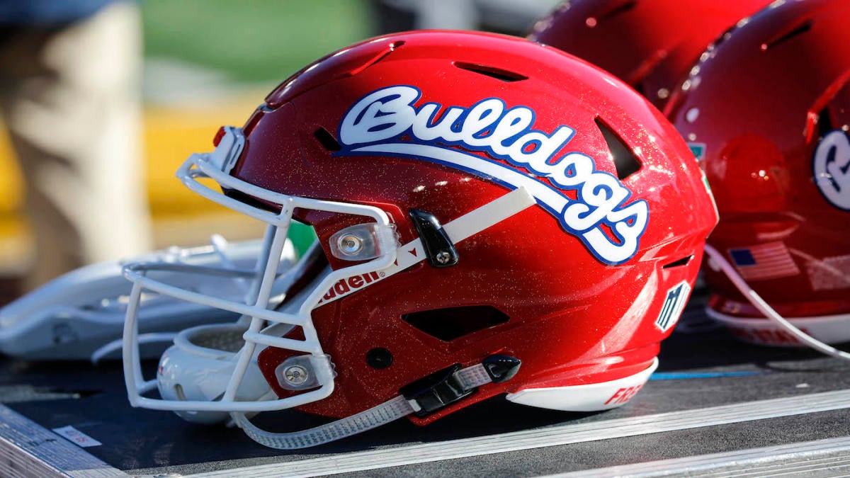
I dig em, but white unis for a home game?
2 Likes
Big 12 means we’re big time now. Pro teams do it all the time! lol
We just wore home unis at Rice, so they have to balance it out. 
OMG!
You and I and would squabble all the way through a style museum. Lol
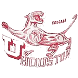
There are two things that represent UH football at its core (IMO)
- Skinny logo
- The lurching Coog
But I know everyone sees things differently.
2 Likes
I don’t think I have mentioned in the last 20 minutes or so that the white helmets suck. So I will do that right now.
3 Likes
OMG!!!
I cai’nt take it no more!!!
The white helmets are fantastic!!!
4 Likes
Those white lids are dope
3 Likes
The Lurching Coog is a 10/10 logo, no disagreement on that front. Certainly a step up from WetCat or ThunderCoog. The only issue I have with it is that it’s nigh on impossible to work into basically anything other than a flag or a t-shirt. Can’t put it anywhere on a uniform or paint it on the field. But in the contexts where it works, it certainly does work.
My issue with the mini-UH is mostly that it’s a straight-line downgrade from its immediate successor. I’d like it a lot more if we’d jumped straight to Phat UH (which is the worst logo we’ve had, IMO). Mini-UH leaves an egregious amount of negative space, to the point where it’s basically invisible in smaller formats.
Really, though, the logo is the least of my concerns with the uniform. Mini-UH was fine enough for a throwback when Ward wore it, and it’s not any worse now. My real issue here is with the enormous, ugly numbers and font choices. It’s way too reminiscent of those cheap knock-off jerseys you can get at the flea market where they just iron on the team name and a number of their choosing onto some cheap mesh. I get that it’s the look they were going for, but it’s not a good one, especially on a jersey with 3 additional logos. It’s extremely busy, and it’s not helped by the fact that, as far as I’m aware, they’re not throwing back to anything in particular. It just kind of feels like a bad fauxback take on our current unis.
1 Like
Yes, I posted that they will be after the game.
Now that you put it in context I’ve swung to your side. Lol
I hate giant numbers. The only place they ever worked was 1970’s Ohio State (without the outline).

And you are right about the classic cougar being hard to mix in. I’d just like to see it on our giant flag before games and on banners.
But I’m a white helmet guy but only when the jerseys and pants are the same color.
2 Likes
Oof. Calling out the 2013 Halloween unis as a miss? Omitting 2011 Homecoming? Including the white-black-black atrocity we pulled against Wazzu and the 2018 Rice look over both of those? This list needs an editor.
Agreed RE: white helmets. Also bad: the red chrome facemasks we tried out for a while.
There are a lot of teams that make giant number fonts work for them – FSU, TCU, Wisconsin, and UGA all came up in an unrelated image search for “2015 Peach Bowl” – but none of those teams plaster a giant wordmark from the top of the numbers to the chest, and they all have better number fonts than the one we chose.
1 Like
Personally I wish we would toss cherry gloss or candy apple into the garbage. It ain’t us…IMO
Are there things you could do with it to make it look cool? Maybe.
Louisville went to a pinkish chrome helmet one time that was cool.
If you lightened the red to a more Scarlet and transitioned it a chrome or gloss I would go along…that would look sweet with the phat UH. But when you use blood red or OU red it just seems to me we’ve entered the poser zone.
2 Likes
Hard disagree on this. It’s extremely us. Every rapper in the state (Devin the Dude excepted) has been talking about painting their car candy red for 30 years. Leaning into that part of the city’s culture is a good move. I just wish we’d slap a silver chrome facemask on it and lean into the candy & chrome combo a smidge more. It also helps differentiate us from the 80,000 other teams that wear red and white. If we’re going to try to be Houston’s team, rather than just UH’s (as seems to be the theme of every piece of branding the AD has put out for the last decade) making this ours is a good idea.
1 Like
Maybe its not the speckles and gloss for me. Maybe its the shade of red. People are going to flame me to damnation but I’ve always thought of our base Scarlet to be like Fresno State’s…
1 Like
I don’t think the uniforms look that bad… but it NEEDS a red helmet! Contrast people! We look like a damn Q-Tip wearing all white! 
1 Like
Don’t do it, Maijin!
I always thought this logo sucked.

7 Likes
Me too. The font is straight outa Hell with a postcard.