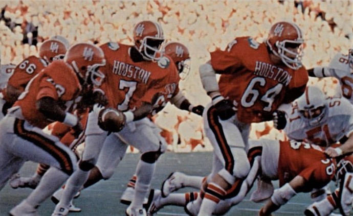
Are they going to have “Cougars” on the back of the jerseys, or is that merely for promo purposes?
It will be the only thing interesting about the Gambling game.
Still po’d we aren’t on our way to a long weekend in Nashville for the Vandy game
I feel really dirty about this new uniform.
I’m a “one uniform for life” kinda guy.
Helmet is ABSOLUTELY AWFUL!!! White helmets SUCK, have ALWAYS SUCKED, and ALWAYS WILL SUCK!!!
These are the best looking unis I’ve seen in quite some time. Very sharp.
Those white helmets are slick.
I miss the pre 95 athletics logo. So unique. Its was even slightly different from the logo on the coach’s hats of the same era. Its just us
It might be the tint of the picture, but I look at it and think Oklahoma State.
I like the red helmet and jersey with white pants. Not a real fan of the white helmets, but I can live with the Nebraska look (white helmet and jersey with red pants for road games.) A third option for special occasions is fine. I liked both teams wearing home unis for Rice - UH. I remember UCLA-USC doing that when they both played in the LA Coliseum.
I like being able to see a clip and recognizing my cougars. With some of the other combinations, it can get hard to determine sometimes.
I like them. They should wear them for a televised game though, a bigger audience anyway.
The helmet would be more impressive if it was glossy white and not matte white.
That’s exactly what I thought.
If the kids like them I’m cool with it.
The uniform has red and white, fine by me. It’s when we wear black or gray that bothers me.
For my money, if we’re going to go back to an old logo, this one’s the move.
The one on these uniforms is similar, but dramatically thinner, and substantially worse. It makes a huge difference, IMO. That said, I don’t really have a problem with our current primary logo. The ThunderCoog logo was never good and should be replaced, but that’s a topic for a different thread.
White at home?
Don’t like when we deviate from true red.
Link to jersey auction
That’s cool haven’t done this in a while since the black one but 3 things
One the Jersey is cool but it has the AAC logo and we’re B12 bound so I’m not as inclined
Two will we do this for the first B12 Jersey?
Will we get Jumpman Jerseys eventually?
When I saw the video, I knew all the coogfans over 40 would be losing their minds. I like the modern setup most of all the Logos. This setup is really clean though. I am happy they’re doing this. It’s a nice homage to the past. Should be used once a year.
Shall I put you down as a probably no?

