https://x.com/uhcougarfb/status/1936171041925349562?s=46&t=R_sceQ4efZTX7nQnRN92Cw
21 Likes
Whoever keeps approving the script look needs to be fired.
20 Likes
Script needs an outline
4 Likes
Why do we keep getting b-tier uniforms?
6 Likes
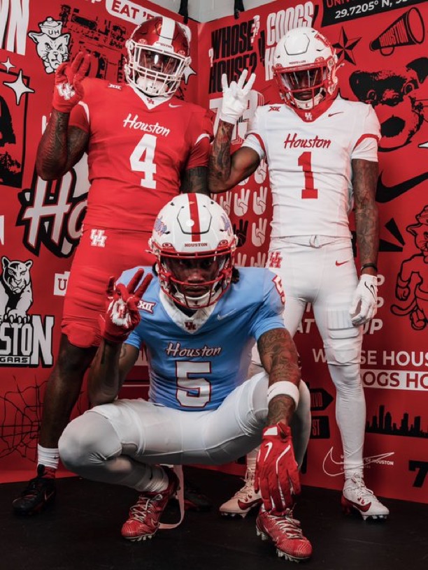
Clean - Script looks great. H-town blue is back.
Downside - no road Luv ya Blue whites
14 Likes
Are these alternates? I hope they’re not the primary rotation.
Good: Script wordmark on the chest is the easiest call we’ve made in years. Immediate upgrade. The all-white look is fantastic.
Bad: Why are the collars like that. I get that Nike’s been doing that for some 15 years now, but still. Ew.
Ugly: Why the super thick white stripe on the red helmet? It’s giving 2012 homecoming, which is probably the single worst uniform we’ve ever worn. Why is it not the same width as the one that goes with the blue jersey?
Also worth mentioning: I wish we’d go back to white facemasks on the white helmets, at least with the all-white uniforms. Are we not doing black uniforms this year?
Overall: probably a slight upgrade from last year. I hope we mix and match these a little; I’d really like to see ![]()
![]()
![]() more than we have in the past.
more than we have in the past.
5 Likes
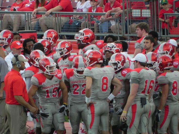
UH uniforms. One of the most polarizing topics on CoogFans. Now on steroids with Houston Blue added.
10 Likes
We are not Alabama lol that red helmet with white stripe oh my ![]()
I can’t stand that script crap. Even on those ugly arse gray jerseys the block HOUSTON looks good. Not dainty or finesse like script.
But whatevs if they win. It’s a shame we have no brand recognition however, with how we mix and match our uniforms. I’m willing to bet we DO NOT wear red, red, white for any home game.
Sorry. Its off-season time. ![]()
5 Likes
Kmart.
3 Likes
Damn. Still no proper red helmet. Candy apple red ![]() .
.
4 Likes
Script looks like crap! Just go back to the darn square lettering already
7 Likes
I don’t mind the script. I prefer the basketball version of the script though.
1 Like
Who thought we needed that stripe on the red helmet?
I’d be ok with a throwback 2 small stripes, but that thing needs ditched. That said, we’ll be wearing so many other versions of the uniforms, does it really matter?
5 Likes
I wonder what school they went to?
The red uniform: Other than the small white trim that they added on the jersey to break up to monotonous red, there is not much that I like about this whole uniform.
Houston Blue: I would have liked for them to just put the UH on the helmet instead of a redundant “Houston” which is already on the jersey. I get that they are trying to make this jersey for the casual, non UH fan but it doesn’t go well together, in my opinion.
All white uniform: nice and clean
The script “Houston” isn’t my favorite. I prefer the “Cougars” script to the “Houston” script for some reason. Like someone on here mentioned though, I would like to see them go back to the block lettering for the football jersey.
2 Likes
I was a block letter fan myself.
1 Like
I think part of the issue here is that our primary logo doesn’t really look good in blue. Someone posted this a couple years ago when we first started wearing them, and it’s just…kinda ugly. It doesn’t really work with two colors. Really emphasizes how blocky our logo is.
I’d still probably prefer that to the script helmet, but what we really need is a decent secondary logo. The script plays that role for us right now, but contexts like this kind of expose that as a poor use of the mark.
For what it’s worth, though, script helmets are very much “in” right now, common sense about triple-wordmarking be damned. It’s a trend that I personally hate, but it is what it is.
2 Likes