More lunacy from the guy out west.
1 Like

3 Likes
I can’t even recognize that helmet since it’s in a color we never use. ![]()
Fudge that white helmet.
2 Likes
What…Kansas should be #16.
I a giant cartoon bird on 60% of the helmet
5 Likes
Our red helmets are not the best, and the wrong red too, IMO. Same old argument we have been having for years, though.
3 Likes
Kansas consistently has the worst helmets in the league, by a country mile.
One of the best placements in ISUs red “I State” helmet. The all red and I State logo are an awful combo and it should be placed in the bottom 25% of the league.
The “Cyclones” script, with the white helmets or, better yet, the gold? Easily one of the best in the league.
But ISU has a history of making awful apparel choices. So we will probably see the “Istate” logo and way too much black unis.
1 Like
Really hoping we can finally get the love ya Coogs road ice white uni for the rice game
Eh, the worst uniform in the Big 12 is still a pretty good uniform. This league as a whole hasn’t really taken that much risk with uniforms, which kind of keeps us in a high floor/low ceiling situation; with a few exceptions, the uniforms range between “okay” and “good.” It’s not like we’re in the mid-00s and teams are slapping butt logos on their pants anymore. It’s the upside of Nike leaning into a super minimalist set of templates.
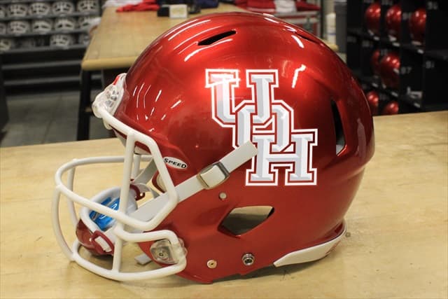
I see a lot of agreement on here, can we get the candy red helmet back to Cougar Red
As long as we don’t have the butt ugly white helmets, I am OK with any others.
2 Likes
The same red helmets and red shirts from the Yeoman days…They were great then, theyll be great now.
4 Likes
In response, UH is rolling these out…
3 Likes
The idea of ranking these helmets is pretty ludicrous in my view.
They’re all the same… a team logo sticker on a helmet in the team’s colors. Maybe a stripe or two.
What am I missing? ![]()
We should roll out a helmet with this vintage logo:
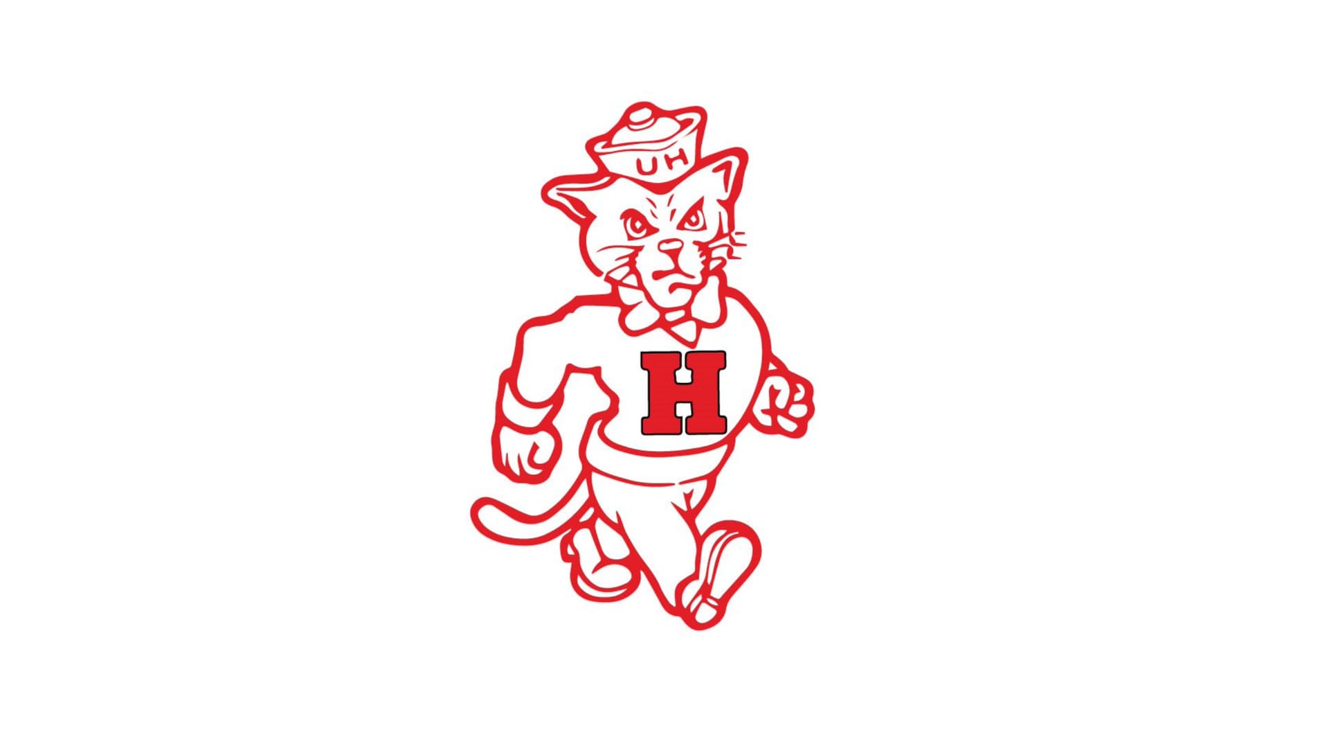
Not sue when we added the “U” but I believe our original logo was just the “H” as on his sweater
6 Likes
Just the need for clicks in the offseason.
2 Likes
I actually like our helmets even with the candy apple red and it looks sharp. I think we have the best helmets
2 Likes
How bout for the 100 year anniversary
2 Likes
What years did they use this logo in the past?
UofH and Affinity Licensing have developed the True UH licensing program with the “Marching Coog” to allow select licensees to create merchandise using these vintage marks to celebrate the University’s proud legacy.