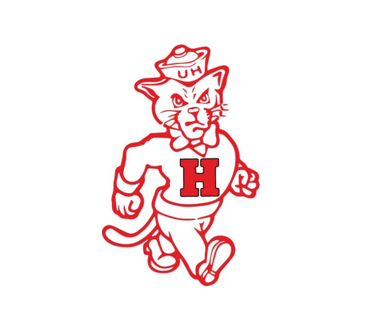
But when was this logo made and introduced? Is it really a vintage logo or just an alternative logo that was made several years ago?
It was never used as the primary logo. I don’t know the origin or what years it was used as an alternative logo. It is trending recently.
2 Likes
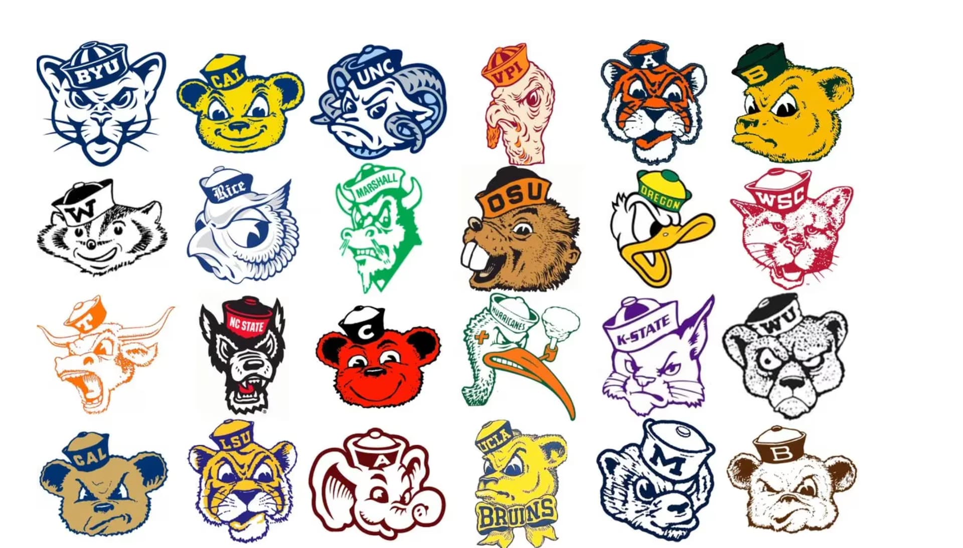
not sure…but apparently there was an era when every college rolled out a “sailor hat” version of their mascot. Looks like the 1960s
2 Likes
Two things:
- Who gives a rat’s rear end what this no-name jerk thinks?
- When he stated, " The world is a better place with more script helmets in it, and I appreciate Oklahoma State doing its part." he is forgetting that hoards of under 30 fans can’t read cursive.
2 Likes
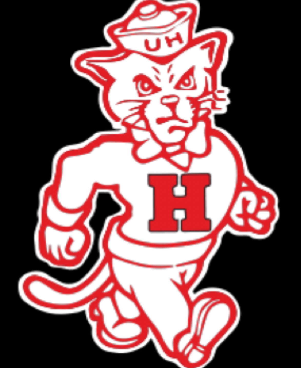
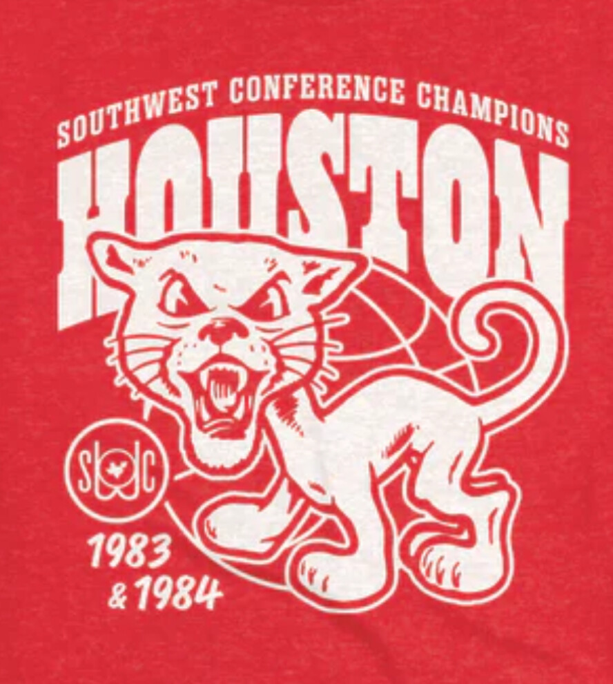
My Central High School Wildcats had that same strutting cat as the UH one.
Not to take away from a pretty popular old fart (alright genX too) gripe, but prob not really relevant. I’m trying to picture a 20 year old squinting at a jersey and thinking “I’m at a Michigan state game, but what does that say… Michigan Dlate?”… not seeing it. Btw UH script is not cursive… look at that H, look at the r and s.
1 Like
Metallic red helmet? Yeah, nice…

3 Likes
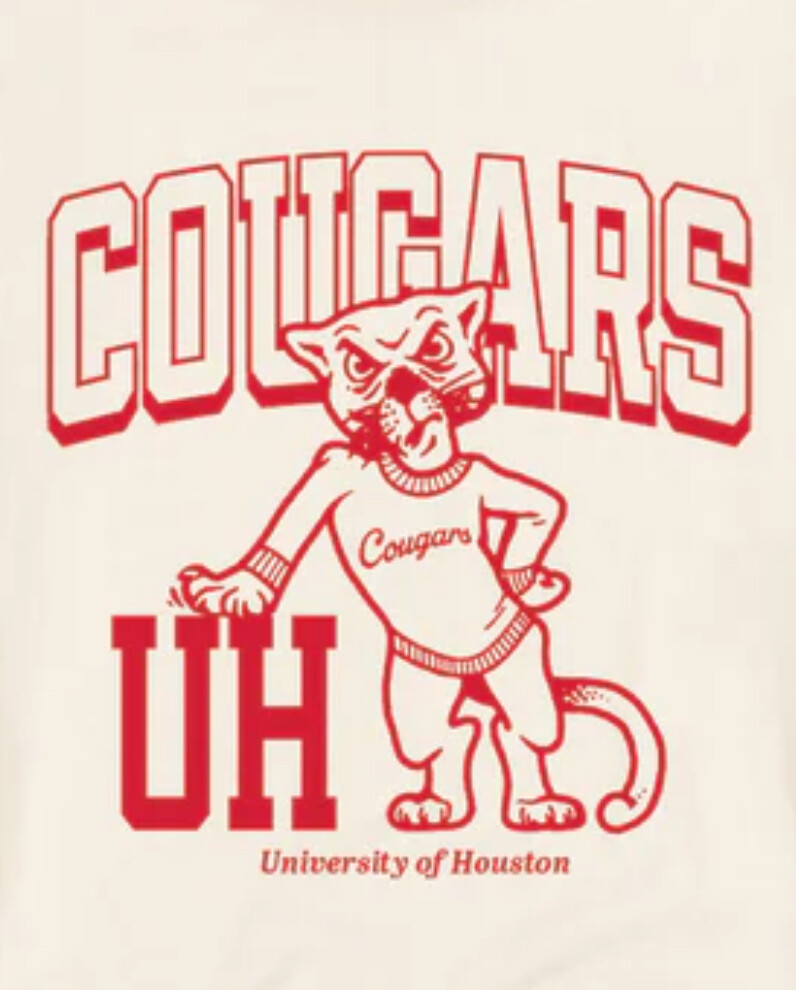
I don’t think UH ever used a block H as a primary logo. From what I can tell, the interlocking UH in some form was basically our first logo, dating back to a club Hockey team we had in the 30s shortly after we became a University. The letter is designed to evoke a letter sweater, which was the way that varsity letters used to be displayed before modern, baseball jacket style “letterman jackets” became popular in the 30s.
@Woodedge compiled a pretty comprehensive history a while back.
Ugliest damn woodpecker I ever saw.
I don’t like script helmets, but heck, these are just helmets, and teams have so many different uniform combos and helmet variations that if you don’t like something just wait until the next game and maybe you’ll like the next one.
4 Likes
Just no.
1 Like
No please no
If we’re gonna do script, I’d prefer it in cursive. Not that looney tunes cartoonish font. Ridiculous
I would like to see an “H” logo.
Just curious. Do any other schools recognize the word “of” in their helmet? This almost seems like a practical joke. If UH paid for that helmet design, they need to get their money back.
I believe that was a helmet that Tony Levine put out for April Fools. It wasn’t ever used.
2 Likes
Yeah that was just April Fool’s