Hadn’t thought about it, but I guess we’ll have to change things up at least a bit for the conference change, as we did when we moved to the AAC.
I have two competing thoughts:
The first is a return to classic form, which honestly I’ve never been a huge fan of in the past but I think fits as we return to being in a power conference. Kind of a statement that “We’re back where we belong”… it doesn’t have to be (probably shouldn’t be) exactly the same, but the old logo and a more classic motif when not doing alternate uniforms.
The second is more of a dramatic rebrand. We’ve almost always had the “UH” on the side of our helmets. Maybe time to try something new. Could do some variation of the Thundercoog logo - Missouri switching from “M” to its cat looks great - but (a) we’re probably swapping that out too and (b) cat’s head maybe not distinct enough from Kansas State.
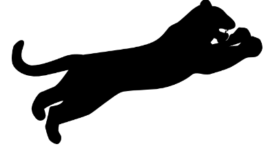
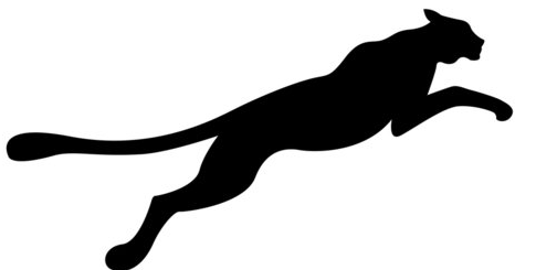
So maybe a silhouette or outline of a full cat running. Think Wyoming or SMU. I don’t think anyone is really doing that and I think if done well it could be some instant branding. I think it also lends itself more easily to different color combinations.
I agree. I am in general a fan of trims, accents, and highlights, and I think we could use them. I think the gray is it. I don’t like the blue. Black is cool but we’re going to be in a conference with both Texas Tech and Cincinnati. Red and gray is not really in wide use. Washington State uses the combo, but I’d generally go with a darker gray than what they use.
I’d like to see something more like this, but I’m in favor of anything over the interlocking UH. It’s just too boring. Interlocking UH should be a throwback once a year.
So…you want us to put the Puma logo on our helmets? The Jacksonville Jaguars tried something similar to that back in the 90s and, even if it hadn’t gotten canned after they got sued by Jaguar, it looked bad.
I think the reason that we’ve never had a cat on our helmets has a lot to do with the fact that I’ve seen a lot more bad-looking cats on helmets than I have good. Say what you will about the letters, they’re pretty hard to really screw up – although we certainly tried there for a solid decade.
I think the consensus about our brand being a little generic is largely correct, but I don’t necessarily think it warrants a full brand refresh. If it were up to me, I’d have us try to take it in more of a hyper-modern direction; as much maligned as the aesthetic is, being effectively the Oregon of the South would do a good job of setting us apart from the dozen other teams that wear red and white. I think “classic” is the wrong direction for UH. Our entire identity off of the field is one of an extremely non-traditional university. We’re not A&M, where you know walking into the stadium that you’re walking where generations stood before, and if you happened to drop into a 100-year time warp you’d take a minute to notice. UH is and should be dynamic and constantly evolving. We’re not a Rolls Royce, we’re a Tesla. We should act accordingly.
Didn’t make the Pumo/Jaguar connection. Can’t have a jumping cat. Could have a charging or prowling one, though.
Could also consider the tear mark we’ve used from year’s past.
Strong disagree on cat logos. If anything, the problem is coming up with a logo sufficiently distinct from the existing ones. I think a lot of them look great! K-State’s in particular. Missouri, Carolina, Jacksonville. We have a couple I think that would look good, too. The wetcat in particular, but also thundercoog. Neither are quite right for the moment (among other things wetcat looks too much like Carolina and thundercoog like K-State) but I think they look good. (I like the front-facing Cougar I use for my avatar, but I don’t think front-facing usually works on helmets.)
Otherwise, I’m not fully unsympathetic to the point you’re making in the last paragraph. It was my thinking with the first thought (going back to our roots). It’s why historically I have always favored “UH” on the helmet. But I think there’s value in punching things up (as with the uniform carousel week in and week out – I don’t like it personally but they’re doing it for a reason.)
Having lived all over, when I see red and white unis, I think about Wisconsin and Nebraska. Bama is a bit deeper red, OU is similar, but not quite the same, etc., but there are bigger names with the same colors.
Changing things up, keeping it interesting, may be the way to help build the brand for a bit