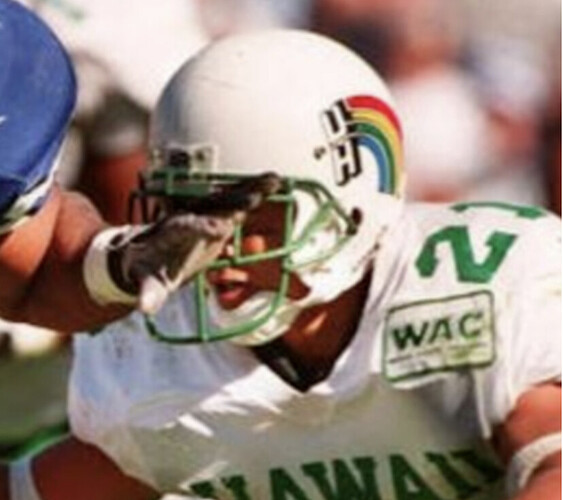
Maryland might be a close second to Penn State in terms of uniform ugliness.
The uniform is myeh but the logo is undeniably iconic.
Picture #1 on the road & #3 at home are really nice.
I also like the all black unis with red sports Cougar helmet. Those are a SOLID third kit.
Best things about this post. NO WHITE HELMETS.
I actually concur on that!
Prefer the red!
Our retro uniforms have been WAY better than our normal uniforms. Our current uniforms are generic at best nothing special or unique. We need something new.
While a sharp look, the white helmets make us look too much like Nebraska unless it’s the all whites. Much prefer the red helmets.
No white helmets and no black unis. We are not the knights. But i don’t care that much.
I think the All Whites look sharp though none look as impressive as those we wore when BY was riding the range.
Might be because I’m female, but USC color combo is hideous.
Uniforms I like
Houston as of now (hope we don’t change bc it’s sharp and the helmets are great with bright red)
ND
Lsu
Neb
OU
A&M
Bama
Arkansas
Tenn
Mich
Ohio st
Wisconsin
Fla st
Miami
Texas tech
Byu
USC
Ucla
Arizona
Those are all good but I like ours best
Tough to be TOO unique and awesome with the most common color combo out there (red/ white), but I do think the red helmet is key
Without that, it really does look like Nebraska.
Black unis are fine, but I can’t see the dang numbers (I blame the poor contrast, and certainly not my 46 year-old color-blind eyes)
Black unis are fine, but I can’t see the dang numbers
Seriously!
Note how much more visible the conference logo and tiny “UH” is here, and it does so without distracting from the red and black. If anything, it helps accentuate it.

(To be fair the “Houston” and number are also pretty clearly visible in this picture, but it becomes hard less readable very quickly with less lighting. )
I can’t make them out from the stands, a thin white outline would make it much easier to read.
Hmm…I see what you’re saying.
To counteract this effect, my old graphic design professor would tell us to use bold white outlining the letters or numbers.
The reason the AAC logo sticks out more than the letters/numbers is because of the white outline.
Perhaps it would be a good idea to apply the same effect to the letters & numbers in this case.
Why? There are like 15 teams who are red and white. Texas, UCLA, Ohio State….so many teams with unique uniforms butUH ain’t one. I wish we would rebrand because red and white is way too common.
We had some unique uniforms with the Peach Bowl winning contrasting shoulders. Not sure why Nike made us go away from those.
Not in favor of a rebrand. Double down on who you are and roll with it. There haven’t been too many college teams that have done this. Maybe make a shade lighter or darker, like BYU a while back, but nothing like color changes from the Rockets or Astros.
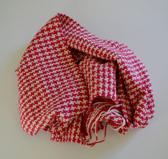
We’ll never change from red. That’s said I wish we had a brand trait that would make us stand out…like a red/white hound’s tooth stripe down the side of the pants.
I’m not suggesting we move away from red as a rebrand. I’m suggesting we add a third color. We’ve done black or grey in alternates. We’ve had dark blue in the past, which Ole Miss uses. They also do powder blue as well. I’ve basically suggested the sane thing for us except I’ve suggested Luv Ya Blue. Ole Miss has it figured out, and their brand is at a very high spot with people loving their uniforms. We don’t have it figured out, our fans whine about white helmets, we don’t attract elite recruits and our stadium is empty.

