Anyone have any images of what the unis will be like this year.
It’s the start of a new two year cycle so I assume things will be modified again.
I did see a promo of a player with the 150 patch on what looked like last year’s uniforms.
I likes the double stripe version so wouldn’t be disappointed but just thought we were due for a refresh.
Any ideas/insight?

6 Likes
I think the uniforms are the same this year based on what the players wore at media day.
1 Like
Hopefully we don’t order from the high school Nike catalog like boring Applewhite did. Live it up, we’re an urban school!
1 Like
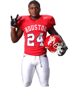
I like the current uniforms. Simple, clean lines and simply a good football uniform.
Outside of Oregon and their technicolor Nike sponsored garb, the majority (if not all) of the best Programs have a simple, classic look. Some have strayed over the years, but came back to the classic look.
That’s what UH seems to have done as well. If it changes to something Red Bull racing would be happy with, so be it. I just prefer the classic look.
2 Likes
I would say that it shouldn’t be as simple as Penn State, but also shouldn’t be as bizarro as Oregon.
There’s a happy median!
3 Likes
Since the basketball team is Jordan Brand…how long before the football team moves to the Jordan Brand as well?
I believe only Michigan, UNC, Oklahoma and Florida are Jordan football schools. The list is much longer for basketball.
We’d have to win and make the NY6 bowl consistently before they would consider us.
I’m all for simple as long as its stylish. We don’t have tradition like the big boys. We haven’t won national championships so no uniform is going to remind us of that. We’re a diverse urban school, we should look the part at least. Look at our brand new stadium, no tradition in that. Did we make it look like Robertson? No, heck no we didn’t. Plus recruits love looking cool in cool uniforms.

2 Likes
I’ve never understood the argument, of comparing out uniforms to the biggest brands because they keep it simple. They don’t need uniforms to stand out, their brand s do that for them. We do need to stand out from the crowd
Not saying we need to be Maryland level eyesores. But we do need something distinctive. I’m on board with the old throwback with the arching letters, with a little more modernization and pizzazz. But we need something in our uniforms that is our own, which right now we lack.
4 Likes
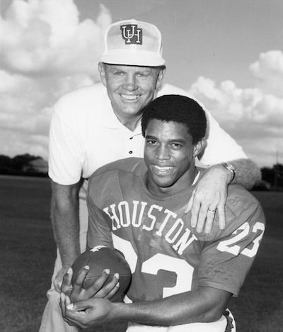
Why go back to a look from the days when the equipment manager would order uniforms out of a catalog. We can’t do better than a standard template from 50 years ago?
3 Likes
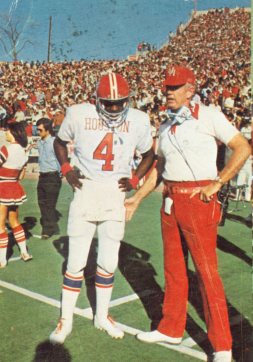
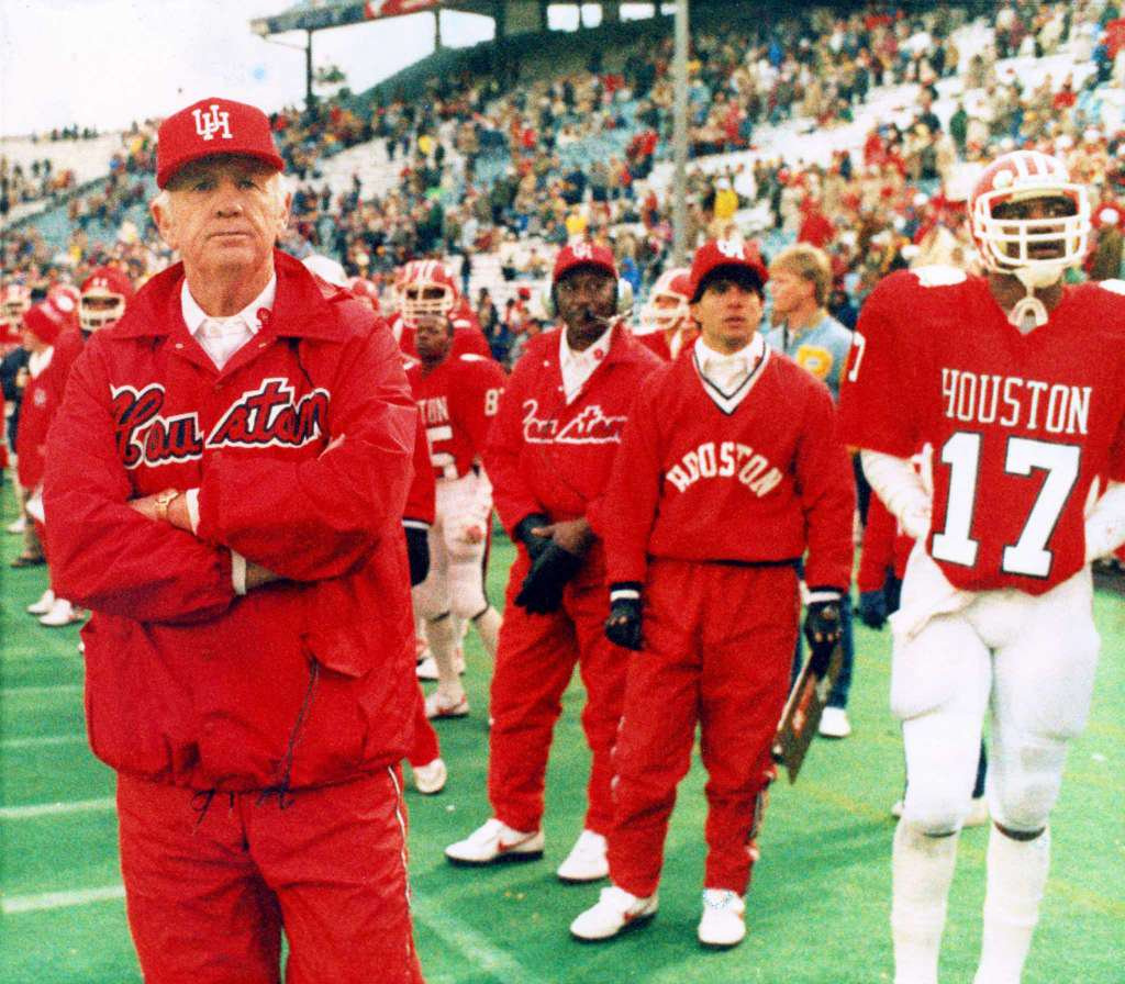
I still like the helmets with the double strip and the throwback look.
2 Likes
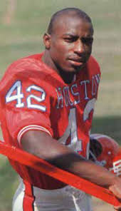
Kill the white helmets.
1 Like
They’re the best looking helmet we have.
2 Likes
Pull the current red helmet logo and put the skinny classic UofH logo on a red helmet with white face mask.
2 Likes
What Charles said!!
How did it we get in for basketball? Because we’ve only been going to the tourney just these last couple of years.
1 Like
There is a video of D’Eriq King on FB throwing a football with a small highlight run after it. He is wearing the new uni with the 150 year patch on it.